You’ll be surprised to know that the single most important factor about landing pages is not one of the elements on the page itself, but the a/b testing that you conduct on it.
I know how exciting it can be when you’ve just put together your landing page and how proud you feel as you look it over.
The endless hours of effort you’ve put into designing, positioning and creating content for your landing page can be overwhelming and in the process of doing so, you might’ve grown attached to it.
And because of this fondness, they’re this one mistake internet marketers often make and that’s not getting their pages A/B tested.
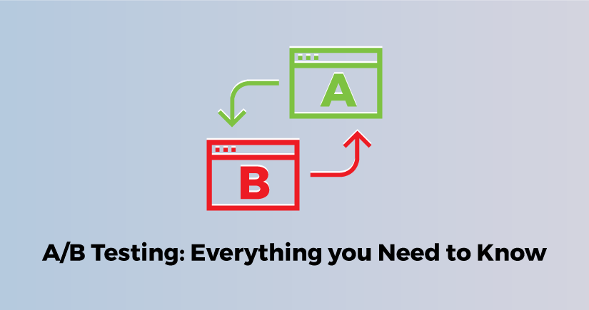
What is A/B Testing
A/B Testing your landing page is like a bee is to honey, like stars is to the night, like a prince to a princess, like a … well you get the idea don’t you?
A/B testing is basically creating two different formats of your landing page or simply altering a few elements like the headline, image, video, CTA buttons, comments section, etc. of your landing page and comparing the two.
By running a test that compares the two layouts, you are opening up two options to different groups of people and getting their reaction to the templates.
The one that yields more clicks or opt-ins wins hands down and you have your pick.
It’s that simple.
Now that you know how the test works let me begin on how you ought to plan your tests and exactly what you should be testing for optimized conversion rates.
Plan your A/B Test
Don’t A/B test just because you can.
Such a course of action would be pointless and a waste of valuable resources.
Before you get your designers and writers out and get them to churn out hundreds of variations, there are three things that you need to determine.
Sit down with a notepad and list the elements that you want to get tested.
If you’ll look at the list above, you’ll see how the list about the things that need to be done is very specific
Although, this is a fake list, this is something that you have to come up with for your page.
Without a proper plan or a list of things that you want to get tested, it’ll be like diving into the Great Barrier Reef looking for a pearl.
I hope I’ve made my point.
2. Fix a time-frame
There’s another thing that’s got to be a part of your plan and that’s the amount of time you are going to dedicate to testing each of the elements against their changed version.
People tend to make this mistake a lot and you are as likely to make one of the two following mistakes:
- Spend too little time
- Spend too much time.
Time in an A/B test is an extremely important factor.
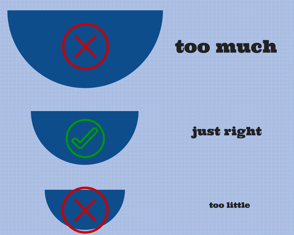
You should run your tests for a period of at least 7 days or until you’ve achieved a 95% confidence level.
If your test-run period is less than a week your results may be biased given that traffic on one day may differ from the other. For instance, Saturday traffic differs greatly from Monday traffic.
Also, 7 days may not be enough to have allowed an equal flow of traffic towards the two or three variations that you’ve launched for testing. Results have been found to differ greatly in a matter of a couple of days so it’s best to allow the software that you are using to determine when is a right time to end your test.
You might say that your pages have generated a substantial amount of traffic within a fortnight for all the variations that you’ve launched, but the numbers may not be enough to declare a winner.
So instead of shutting down a test in the early stages, you might want to let it come to a boil because not doing so may actually cost you in the long run.
Therefore, have it planned out as to how much time you might have to allocate for each of the tests and where that puts you in the bigger picture of your plans.
3. Test one thing at a time
Finally, what you have to keep in mind is that you can’t alter more than one element when you’re starting your tests.
Let me explain myself.
First, set your control and treatment, where your control is the first design and the treatment is the newer or changed version.
In the case of the two images below the first would then be my control and the second would be my treatment.

Suppose you’ve got two new elements that you want to test; a new position for the video and a changed color combination for the CTA button.
What you have to do in that case is run several separate tests so as not to mix up the results.
Try going with the newly placed video first. After you’ve let the test run its course and you’ve gotten your results, you can run another test with the changed color of the CTA button.
This way you’ll know which element has brought about which result and you can take your final decision based on that.
Now that we’ve gotten the planning cleared out, I’m sure you’re prepared to move into second gear.
What to A/B Test
You already know how to conduct an A/B test and when conducting one what are the things that you need to keep in mind.
So what I’m now going to tell you is what are the various elements that you could be testing and what about them you should be keeping your eyes open.
A/B Test Images and Videos
Some of the most common elements that boost the conversion rate of a landing page are the visuals: the images and videos.
While these are some of the most important elements, these are also often the most misused elements given that they aren’t always widely used.
There’s no denying that images are often the main reason that visitors don’t run away scared, but images that lack either quality or relevance to the content could render your visitors clueless, annoyed and departed.
Tests show that images of smiling people do us a world of good because smiles stimulate in people a sense of comfort and security and, therefore, increases in your visitors trust.
In fact, a case study had shown that a particular page with a model experienced an increased conversion rate of 102%.
Of course, if you don’t need a human face then don’t unnecessarily force one into your page. A good picture of your product ought to do the trick.
In case, you’re trying to sell a service you can always embed a video that allows you to interact with your visitors.
An interactive video not only tells your visitors that there’s a real person behind all the technology that they see, but it also allows you to explain what you are trying to help people do.
A/B Test the CTA
The CTA is perhaps the most tried and tested element of a landing page since this is the life of your business, right?
The CTA or the call to action button encourages, begs, tells or directs people towards an action that ultimately turns them into a convert and is going to give you the benefit that you’re seeking.
Here are some of the most worrisome aspects of a CTA button that you should look into as well:
- The color
The thing about CTA buttons is that they have people worried about its color.
There’s not so much a problem with any particular color except when the colors don’t match the color of the background or the color of the text.
While the image above shows that orange is the best for buttons, another source shows that red is a better option.
In fact, in another study, it has been proven that for a button the color red fares much better.
I believe that it’s the color red and the slight variations such as orange and ocher that do better than other buttons in general.
- The phrase
This is another one of the mind-boggling aspects of the CTA button.
What do you say on a button? How do you tell our visitors to opt-in for something without sounding desperate or overbearing?
Well, people have now found innovative ways of doing that and to be honest, there’s actually no hard and fast rule as to how you phrase your words.
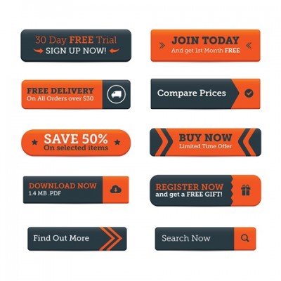
I’m pretty sure that you’ve seen the phrases on these buttons in the image above at some point or the other in your long history of internet traversing.
While these may have been effective, the buttons that are more effective tend to have wording that allows the user to feel in control.
For instance, instead of saying ‘sign up’ you could say ‘sign me up’ so that when the person clicks on the button he or she feels more in control of what they’re doing rather than feeling like they’re being forced to do it.
The word ‘your’ and ‘my’ could make a world of a difference.
See what I’m saying?
- The position
The last but not the least important aspect of the call to action button is where it is placed.
This can be equally frustrating if you’re groping in the dark, but there are certain pointers that are followed as a rule of the book.
- Place your CTA button above the fold. That way your visitors will, at least, know what you’re calling them to in case they leave before they even scroll down your page.
You’ll be amazed to know that in a particular study by placing the CTA button below the fold a 304% increase in conversion rate was achieved.
- Place several CTAs. By reiterating your call to action, you could actually get someone to do what you wanted them to.
Which is why you could place the buttons at the very beginning, between your texts or at the very end. It’ll be like a challenge for them to ignore your calling.
A/B Test the List of Benefits
This is basically announcing you to your visitors if haven’t already done so.
All you have to do is list the services or goods that you provide and let people know what they can avail from you.
This is how you’d normally make a list of the services you’ve offered.
ZestAnalytics for instance allows you to test how your landing page is doing using mouse tracking heatmaps, click heatmaps, attention heatmap and such.
So what you would want to get tested if you made a list of your services is whether you’d want to make a list like this or would it do better in some other way.
A/B Test Customer Testimonials
Finally, we’re done to the last element that you might want to test and that’s the customer testimonials or reviews about your services.
Customer testimonials or reviews act as social proof that allow your visitors to see that there are other people out there who have taken your service and approve of it.
So what you’re basically going to be testing here is not whether it works or not, because testimonials obviously work. What you will be looking to test is how best they can be placed or how they can be made more visible.
If you’re hard pressed for space then you might want to see if you could provide testimonials without pictures of the people who’ve reviewed although stats say that testimonials with pictures tend to do better than those without.
Conclusion
From all that I’ve told you from the beginning, you might have already figured out how A/B testing could be the source of life for your landing page.
Never go with your intuition unless you got it tested.
And once you do let me know how everything’s firing.
Related articles: design a high converting landing page, effective landing pages, top marketing channels, customer behavior analysis