
With each passing year, more people dump their laptops and desktops and opt for mobile devices.
With mobile devices, you’re always connected to the web everywhere you go as long as there’s internet connectivity.
As a marketer or business owner, you should care about mobile because it’s where consumers spend the majority of their time online.
Write short headlines
Writing for mobile takes the writing challenge to a new level.
Every word counts. Every word should be readable and engaging in any screen size the user chooses.
Have “mobile” in mind when writing headlines.
According to numerous studies, the ideal title length is 55 characters.
When you visit the sites of top web publishers, you’ll quickly notice their headlines are short.
Most of their headlines are under 55 characters.
Shorter headlines are also good for SEO. It means Google won’t cut off any part of your title.
For example, when I entered the keyword “travel hacking,” into Google, below are the titles of sites that appeared in Google search results.
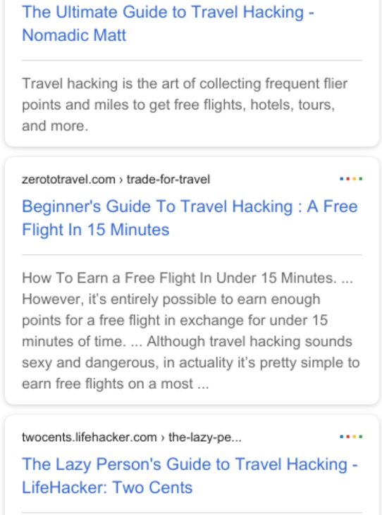
These sites are within Google’s limit of 50 – 60 characters in the title tag.
The common reason why writers use long titles is to oversell their content. Don’t do that as it could make people lose trust in your content.
Therefore, write your headlines with very few words.
Write short sentences
It’s harder to read on mobile than desktop.
Why?
Because it’s difficult to focus on mobile.
Mobile users have tons of apps vying for their attention all at the same time. So, it is almost impossible to be on the same web page for too long.
Users constantly receive notifications from Facebook, Twitter, Gmail, WhatsApp, Instagram, Facebook Messenger, etc.
A quick look away from your page could mean they are gone forever.
You need to keep people on your website to have any chance of turning them into customers.
Write short sentences.
Short sentences are fun to read on mobile.
Long sentences are not. They put web readers to sleep.
Here’s an example of a long sentence:
“Your content is a big part of providing the journey a person needs to help self-diagnose whether or not your solution is right for them.”
And here is it after being rewritten into two short sentences:
“Content is a major deciding element for prospects. Their search for solutions goes through your content.”
Which one is easier to read?
I’m sure you’ll choose two short sentences.
Write short paragraphs
According to Jakob Nielsen, founder of the Nielsen Norman Group, people don’t read web pages word for word. Instead, they scan.
Nielsen did a study to find how well people read on the web.
His study found that the average web users read 20% of the web page during their visits.
Web users are bad readers because the web itself is filled with distractions.
Humans have short attention spans. The average human attention span is 8 seconds, which is shorter than a goldfish.
A goldfish is believed to have an attention span of 9 seconds. Keep in mind that goldfish are known for being highly unfocused.
To compete in the mobile world, you need to say it quick and say it well. The good news is, you can achieve both in short paragraphs.
Short paragraphs encourage reading.
Let’s assume you’re presented with 2 articles. One has long paragraphs, and the other has short paragraphs. Which one will you choose?
I bet you’ll pick the article with short paragraphs.
Top publishers like The Guardian and New York Times are now instructing their writers to create short paragraphs to enable their sites suitable for mobile.

Short paragraphs make your page has lots of white space. And lots of white space promotes reading.
Replace long words with short ones
Here are the two rules I follow for simple writing:
- Don’t use two words where one will do
- Don’t use long words where short ones will do
These rules are even more important in the mobile world.
Some writers use long words to show they are smart or educated.
If you want to convert browsers into buyers, you’ve got to build trust and credibility. You don’t achieve that by using big words.
Write in plain words people use.
“The difference between the almost right word and the right word is really a large matter – it’s the difference between the lightning bug and the lightning.” – Mark Twain
When you use big and long words, no one understands your messages. Therefore, no one buys your product or service.
Stay away from words like utilize, synergy, feckless, facile, and other pompous words.
Avoid long words like simplification, demonstrating, vocabulary, and de-escalate.
Use easy instead of facile.
Use limit instead of de-escalate.
Use grow instead of accumulate.
Use start instead of initiate.
There’s also another situation where writers use two words where one is possible.
Examples are:
Afford an opportunity instead of allow or let.
At this point in time instead of now.
In a timely manner instead of quickly or promptly.
Short words allow web users to read your content with speed and understand your points.
Below is a complex sentence filled with long and big words:
“It is impossible for one to adequately assess the worth of a volume merely by examining the covering.”
Here’s a rewrite of the above sentence using plain words:
“You can’t judge a book by its cover.”
The rewrite is easy to understand.
Before hitting “Publish,” make sure you double-check each word you use.
Are there places you used long words where short ones are possible?
Are there places you used big words where plain ones are possible?
Are there phrases where one word is possible?
Double-check!
Long words won’t sell your product or service on mobile. Use everyday words instead.
Use a lot of images
If you’re marketing anything online and want growth and engagement from mobile web users, you need images. Lots of them!
Images help you capture and keep attention in the mobile world.
Image sharing network, Instagram has over 400 million daily active users.
They’ve been a rise of images on the web over the past years. The reason is down to the incredible growth in the adoption of mobile devices.
Why should you use lots of images?
Research shows that people remember 10% of what they hear, 20% of what they read, and a whopping 80% of what they see and do.
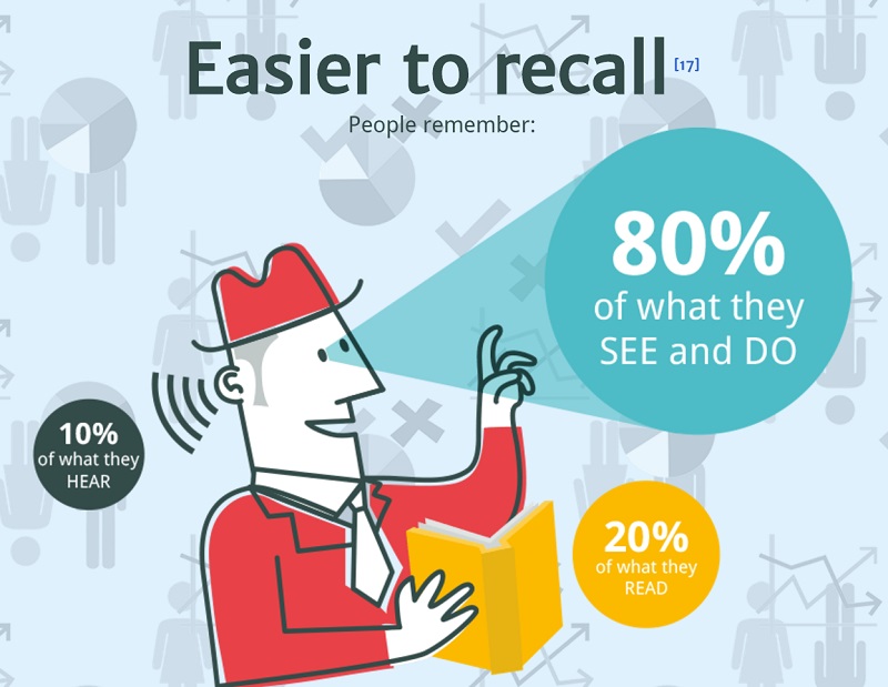
Images fall into the category of what people see, of course.
As they say, “a picture is worth a thousand words.”
You need images to help people recall your brand on mobile.
Embrace minimalism in your website design
“Perfection is achieved, not when there is nothing more to add, but when there is nothing left to take away.” – Antoine de Saint-Exupery
A perfect mobile design is required to succeed in digital marketing.
The perfect mobile design contains nothing but your content and your call-to-action.
Mobile users are easily distracted.
So, as soon as they land on your site, you want them to focus on your message and take action. You remove any unnecessary elements that may prevent them from doing these.
That’s why you need a minimalist web design.
Over the past years, we’ve seen different design trends.
There’s one design concept that has survived for ages.
It is a minimalist design.
Today, the minimalist design concept is more important than ever because people find it extremely difficult to focus on anything on the web.
With a minimalist design, you help people focus on the vital information you want them to read and the actions you want them to take.
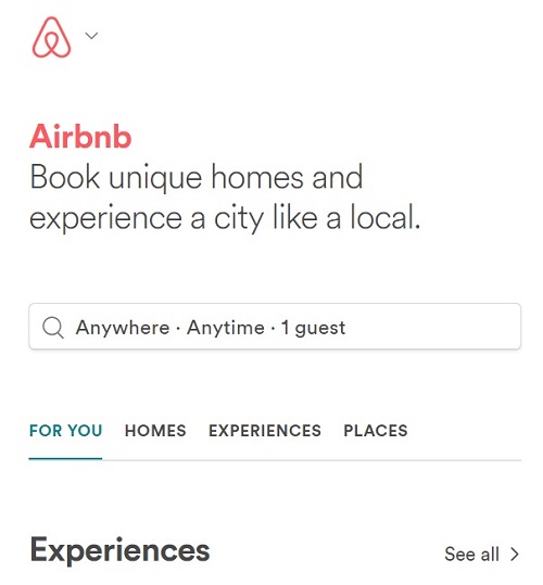
For example, as soon as you open Airbnb’s site, they show you a message that asks you to act. Nothing else.
There’s little time to waste on mobile. That is why successful marketers adopt the minimalist design concept. It helps them get web users to take action within a few seconds.
Get a responsive design
Designing for mobile is more challenging than desktops and laptops.
Most desktops and laptops have the same screen size. That can’t be said of mobile.
There are various mobile devices with different screen sizes.
Another issue is that most mobile devices’ screens (smartphones and tablets) can be viewed in portrait and landscape forms.
There’s a perfect solution for this:
Simply get a responsive design.
Responsive design can adapt to any screen size.
Your website has to be usable on every mobile device out there.
With a responsive design, your website will automatically adjust its look to any future device with a new screen size.
Don’t just get any responsive design. You need a design that loads your website with extreme speed.
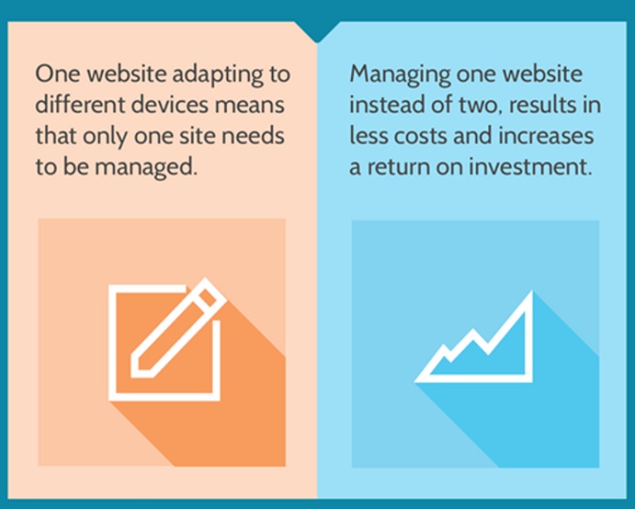
Getting a responsive design also means you don’t have to create separate sites for desktops and mobile devices.
A positive mobile experience for users will surely boost your sales and revenue.
Design for touch on mobile
Mobile devices are operated with touch. There’s zero need for a mouse.
Because most mobile devices have tiny screens, your website should be designed in a way that it accommodates fingers and thumbs.
Mobile users should recognize your call-to-action buttons at first sight. There should also be enough space around buttons to help them stand out and appear finger-friendly.
For example, you can quickly see that HubSpot’s “Get Started” button is a link. There’s also enough space around the button to make it finger-friendly.

Your website call-to-action buttons should look like that too.
Conclusion
By optimizing your content and site for mobile, you’ll get more customers from mobile devices.
According to a study published in Media Post, consumers start researching products on mobile, and 78% buy within a day.
Mobile is very vital to e-commerce.
Thanks for reading and please share this article with your network.
If you have questions, I’d be happy to answer them in the comment section below.