How you can treat your squeeze pages back to high converting Macho’s.
Although squeeze pages are an efficient way to obtain leads, in most scenarios it’s been found that a squeeze page with high traffic volume is generating relatively low leads. I know how frustrating this can be, especially when you can’t find any good solution for it. Well, don’t worry, I’ll tell you the 9 major diseases with squeeze pages and how you can treat and nurture them into lead magnets.
1| Having dulled and unattractive Headline
According to Marketing Sherpa, only 77% of marketer who test are testing their headlines. Headlines should not be generic or boring, headlines should spread a welcoming feeling to the visitors to greet them and let them know the point of the page. According to copy bloggers’ “How to write Magnetic Headlines Post“, 80% of your traffic will just read your Headline and decide whether they want to read the rest of the post or not.
The first impression is the last impression that your page will make to convince visitors to spend their hard-earned money on your product.”
Ok, now that you know what’s wrong with your Headline, here’s how you can fix them.
Make sure that the headline is specific and reflects the contents of the page.
The headlines should be long enough to convey the message but not so long that the visitors click off the page.
Address your visitors by using terms like ‘You’ & ‘I’, to give your visitors a feeling of closure and hook them to post.
Effective headlines usually involve logical sentence structure, active voice, and strong present-tense verbs. They do not include “headlines.” As with any good writing, good headlines are driven by good verbs.
- Include Figures and Statistics
- Don’t sound like an ad
- Highlight benefits rather than features
- And don’t forget subheadings.
2| Asking for too much Information
A huge turn off for your visitors is having to provide too much information, such as a long form on your Opt-in Page.
Look at this form, I think you will agree when I say that it’s absurd, just imagine a squeeze page giving you this form to fill to download a some e-books, for example, will you fill this up for the download, I sure wouldn’t. I mean it’s just a digital media, this form gives me the feeling that I’m buying a house or something of that size, it’s ridiculous. Your visitors would rather leave your page than type in too much-requested information.
This is why you should be very careful when you’re making your form. Keep your form short and easy to fill, refrain from asking unnecessary details and only ask for the information that is relevant for the specific purpose and those you absolutely need. Like,
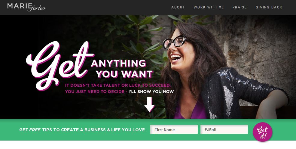
Marie forleo has done a good job with their Opt-in, rather than asking for tons of personal information they just asked for the first name and e-mail for their free gift, this is a good technique and it has proven to be quite efficient.
You can make it even better, by just asking for their e-mail/mobile number and nothing else for subscribing, it would essentially turn your visitors into leads and it is the best way to maximize lead conversions.
3| Putting Multiple Call to Actions & placing them like a needle in a haystack.
According to Marketing Sherpa, 48% of landing pages contains multiple offers, and this confuses customers causing lower conversions, and squeeze pages with multiple offers get 266% fewer leads than single offer pages.
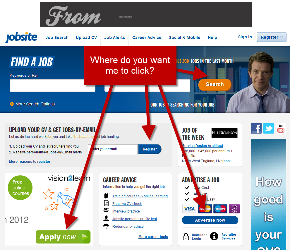
Look at the chaos on this page, there’s a search bar, an opt-in, 2 CTAs, this is a mess, you don’t want this. Trust me. Confusing your visitors is not a good idea if they can’t find what they came for at their first glance, most of them would rush to the back button.
You can fix this, by keeping things simple and having one offer per page and make your call to action easy to find and noticeable.
Trust me, you want, no, NEED to make your CTA stand out. Let me explain what happens if you don’t,
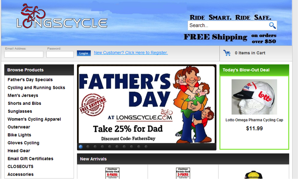
See the “Blowout Deal”? Where on earth would you click to check it out? The image? There’s no button, not an invitation to check it out… it’s just. there. To navigate to the product page, you have to click the text, which isn’t even dressed up like a link.
See my point yet, hiding your CTA in an ocean of clutter is a death wish for conversions.
I’ll tell you how to avoid this kind of turn offs.
- Start by using contrasting colors to make your CTA obvious.
- Make CTAs buttons Big to draw more attention.
- Hyperlinks should come in a contrasting color – but be careful about deviating from the tried and tested blue shade we’ve all come to know and understand.
- Refrain from using muted colors like gray for your CTA buttons.
- Match your CTA button to stand out and avoid putting distracting materials around it.
4| Too Much Text
One of the most important factors of a successful landing page is its simplicity. This is one of the easiest mistakes to fall for, as well, as it’s difficult not to want to add more awesome selling points of your business or product. So how can more reasons to buy actually hurt your conversion rates?
Well, it’s because nobody’s reading them. Too much text on page is confusing, and visitors might not understand the point your page is making and what it is offering, and if visitors cannot determine the point of the page they will leave, and your page has approximately 5 seconds to capture visitors attention, or else they would run screaming to the back button.
The best way to tackle this and still put everything you want on your page is by utilizing bullet points, along with BOLD to set off text and draw the eye, avoid making multiple paragraphs and don’t forget to highlight important points of product or services and put images to draw more attention.
5| Using No or Stock Pictures/Videos
Having too much text on the opt-in pages of your website is not helpful for your visitors. Keep in mind that the landing page should get the user’s attention and make him/she understand the basic features of your product/service. The rule “less is more” applies in this situation. Present to the user the most important aspects of your product/service and provide him a way to read more details if he wants. Use clever graphics/visuals to pass hidden messages and don’t forget that a picture is worth a thousand words.
Everything on your Opt-in page should define something and serve a purpose. Stock images do not serve the meaningful purpose. It’s kinda obvious, and visitors will instantly notice the fake tasteless vibe that it give off. Seen these people

I thought so.
Stock images/videos are doing nothing but devaluing your brand, wasting landing page real estate, and possibly even annoying your user. Men in suits shaking hands? Multiracial workers smiling? Chick with a headset? They’re all out to get you. Stock images/videos are like Hitmen with a contract to kill your conversions. Cheesy stock photos hurt your credibility and show the world you’re… ignorant.
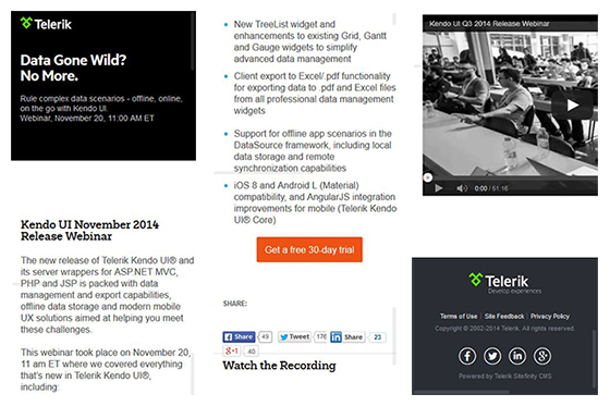
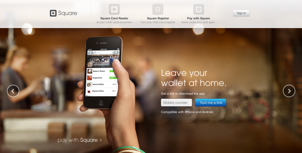
The people over at Telerik’ has done a good job with their wording and media placement. They have used custom high-quality images and videos and placed them to give off a scent of authenticity.
Ok, I’ll tell you some crucial points that you should keep in mind when you are posting medias on your page. Your images/videos should communicate your content, they must be appealing to the eyes and flows easily with your page. Make sure to make your medias stand out without contrasting too intensely and be evocative to encourage engagement with your visitor and use abstract but appealing mix of colors, words, and shapes.
6| Glitches in Technology
To keep your conversions high, you need to make sure your technology is working right. When people click the subscribe button, you don’t want them getting this:
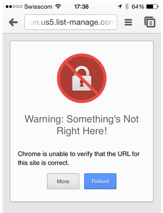
Like that’s a trust-builder!
[Tweet “Invest in the best technology you can afford. Make sure your servers has 99.99% uptime.”]7| Landing pages take too long to load
40% of consumers abandon a website that takes more than 3 seconds to load and 79% of shoppers who are dissatisfied with website performance are less likely to visit that site again.
Fix this by cutting off the clutter, Get rid of unnecessary text and graphics, and test pages on different devices and optimize loading times.
8| There is No testing done to see what is working
According to HubSpot, companies with 40+ landing pages get 12 times more lead than those with 5 or less and according to ION Interactive, Dell, now with well over 1000 landing pages, has seen conversion increase as high as 300% when testing landing pages against web pages.
Test a few landing pages and track their results, anything that is not increasing the conversion rate should be changed and it is salient to test market ideas, page layout, and wording to determine what changes will get the conversion. Having several versions of landing pages available and seeing which pages are getting the most click-throughs with A/B Split tests is also very important. Never stop testing and tweaking.
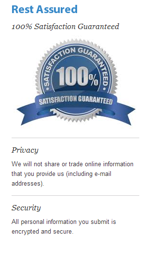
9| Lacking Credibility
Without credibility your visitors have, by default, no reason to trust you. Generic Endorsements are a key aspect. 68% of consumers trust reviews more when they see both good and bad scores.
Related articles: how to create optin page, ways to make landing pages, create emotionally engaging landing pages, landing page conversion