A lot of things happen when your bounce rate is high:
Improving traffic from search engines is difficult.
Email signups would become low.
Getting more leads is tedious.
And the number of new clients would drop to an all time low.
High bounce rate is bad.
It’s one of the worst things that can happen to a website owner.
Whether your business is a business to consumer (B2C) or business to business (B2B), you need to keep your site’s bounce rate to the lowest levels as possible.
Why?
If people aren’t spending time on your web pages, converting them into customers is nearly impossible.
Maybe you’re feeling a bit confused about what a bounce rate is:
“A bounce happens when a web user visits a single page on your website.”
(GrowthFunnel_Code)
Let’s say a search user visited your homepage and left after only 10 seconds or 10 minutes without clicking through to other pages on your site – that’s bounce.
This is how we calculate bounce rate:
If 100 people landed on your website, and 70 people left without checking other pages during that visit, it means you have a 70% bounce rate.
The lower your bounce rate, the better.
Google Analytics is a sweet tool for getting your site’s bounce rate.
It also lets you see the bounce rate of each web page on your website.
If you haven’t installed Google Analytics on your site, you should do that after reading this article.
Let’s assume you’ve installed Google Analytics already.
When you sign into the GA dashboard, click “Audience,” then “Overview.” You’ll see the bounce rate for your overall website.
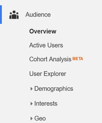
Here’s the bounce rate report for one of my niche websites:
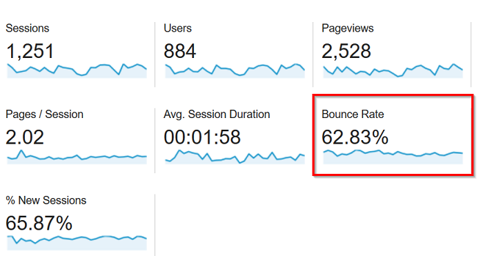
62.83%. There’s still more room for improvement. Maybe I could hit 10% bounce rate.
It’s very possible.
I’ve managed sites with bounce rates as low as 3%.
0% bounce rate is nearly impossible.
Let’s talk about keeping your bounce rate low as possible.
How can you do that?
Get A Clean And Useful Navigation
Could you imagine landing on a website with no navigation?
It would be like trying to find your way in the ocean with no compass. It would be terrible.
Navigation is the key to a great usability.
It tells people how to use your website.
It tells them where to get exactly what they are looking for without wasting their time.
A site with no navigation is completely useless.
Navigation on a website is mostly located in two places:
- First, in the header
- Second, in the sidebar
Amazon’s homepage navigation is very easy-to-understand and use.
You can see links in the header.
And you can also see links in the sidebar when you put your mouse cursor on “Department.”

This makes Amazon so easy to use for web shoppers.
I admire the navigation of Miss Julia Piep. It looks so slick.

Miss Julia Piep has worked with top brands such as Sony Music, IKEA, and Mitsubishi. You can expect her website to be top-notch.
Your navigation should only have the relevant and most useful links of your site.
When your navigation is full of a bunch of links, it makes it difficult for web users to select where to go on your site. And when decision-making becomes hard, they would rather leave than sifting through the navigation.
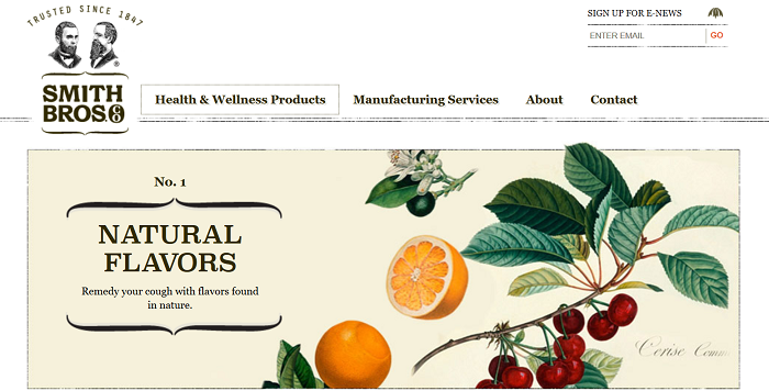
Including a handful of links on your website makes visitors’ decisions easier. That gets visitors to the next pages, thereby reducing your bounce rate.
For example, the Smith Brothers website has a simple navigation. Notice how there are very few links on the header.
Make Every Web Page Useful, Interesting And Attractive
Just like your everyday life. You want to squeeze the most out of your day. You want to make every little thing you do worthwhile.
“Success in life is founded upon attention to the small things rather than to the large things.” – Booker T. Washington
This applies to your website too.
No one wants to land on a web page that serves a zero purpose and doesn’t contribute any value to their lives.
Every web page on your website should be useful to the visitor.
It should be interesting and unique too.
Don’t forget each page a web user visits is a chance to deepen your relationship with him/her.
For example, Copyblogger’s “About” page is unique.
They tell you a story of their founder and the business.
It makes the page interesting. And just the headline alone is enough to get your attention.

The “About” page of Moz is my favorite.
The design and layout of their About page set it apart. You can take inspiration from that.
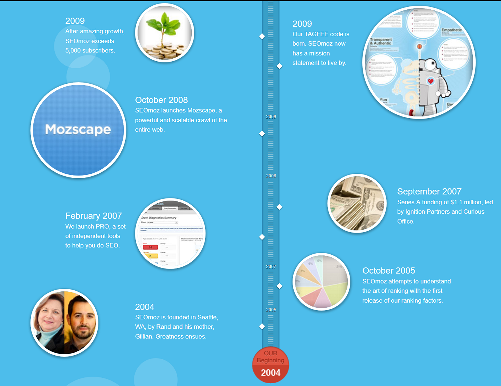
I have no doubt that the bounce rates of these pages are low.
When businesses like these can invest so much into the design and content of their “About” pages, it shows they care so much about every page on their site.
That decreases bounce rate for the overall website.
Every page should count.
Every page should be well-laid out.
Never make a quick junk web page. It won’t improve the reputation and trust in your business. It will only damage it.
Get A Simple And Minimalist Design
The best websites are very easy to use.
Even a 5-year old kid could browse through them and understand what they do.
The best websites are simple. They contain the bare minimum stuff.
I like minimalism.
I’m a big fan of Leo Babauta, the founder of ZenHabits.
I like that blog. I’ve been reading it for the past 5 years.
You’re only on his blog to read. No fancy links. No sidebar. No big visible footer that takes your attention away.
No wonder the site receives over 2 million visits on a monthly basis. And most are returning visitors.
When you visit the site, it looks like it’s on a diet.
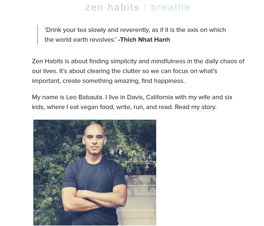
I’m not like saying that your website design should be exactly like ZenHabits.
What I mean is that your site should contain the minimum things visitors really need.
For example, the Xero’s website is very minimalist. You’ll quickly decide where to go immediately after landing on their homepage.
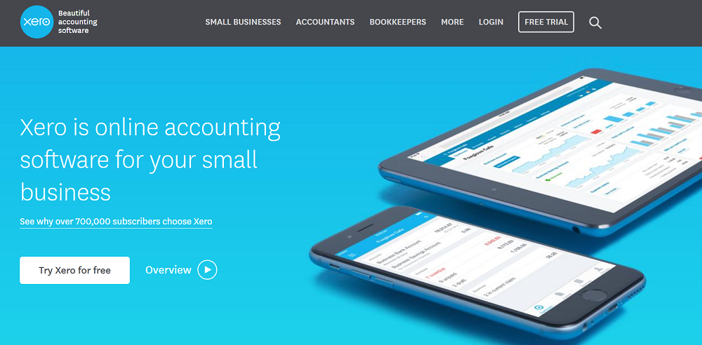
I’m big fan of Alex Turnbull and a regular reader of the Groove blog.
You’ll see that the blog is so simple, and you’re only focused on the content. No distraction at all.
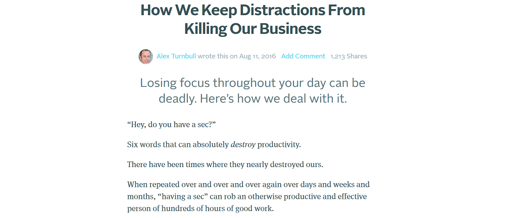
Notice how the blog has lots of white space that makes reading so easy.
Writing Interesting Post Excerpts On Your Homepage
If you have a blog, there would be an homepage where people must go through to find all your blog posts.
This could be your original homepage.
Or, it could be your blog homepage.
For example, when you visit Copyblogger, they have a homepage for their blog, and you can read each post excerpt before deciding to click.
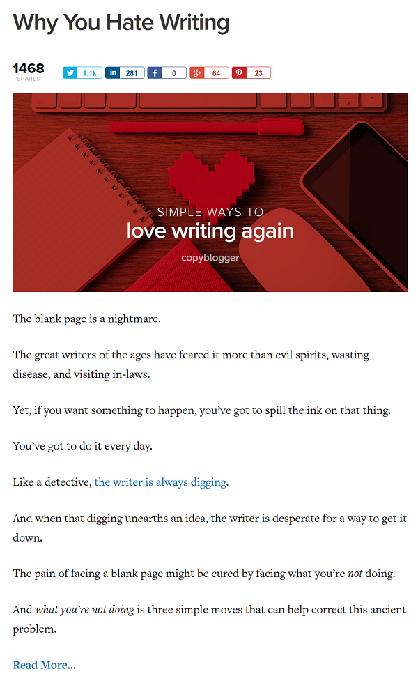
What this does is that it raises the interest of the visitor in your blog post.
After reading the post excerpt, and if they find it interesting enough, they are more likely to click “Read more” to continue reading the post. That reduces your bounce rate.
Such visitor could read more than one post through landing on your blog’s homepage (or main homepage).
Note that you shouldn’t just write excerpts for your posts. (Excerpts are the first paragraphs or the introduction before readers get into the meaty stuff).
Your excerpts should be interesting that visitors can’t wait to click the “read more” button.
Always Put A Call-To-Action At The End Of Your Content
This one is vital.
When someone finished reading your blog post, they think “what’s next?”
This is where your call-to-action should come in.
Your call-to-action tells readers what you want them to do next.
It could be that you want them to subscribe to your email newsletter.
Maybe you want them to sign-up for your membership program.
Maybe you want them to read other interesting and educative posts on your blog.
Or, you want them to know about your upcoming webinars.
In most cases, people must click a link to visit the page.
When most of them do, your bounce rate improves.
A blog post without a call-to-action is worthless.
It’s of no use to you and the visitor.
I’ve seen bloggers who put call-to-actions at the top of their contents. Visitors see the CTA before they start reading the content.
I’m not a big fan of this because it interrupts the reading experience rather than encourage it.
When I see a highly-respected author like Tim Grahl using top of the content CTA, it means it’s boosting his conversions.
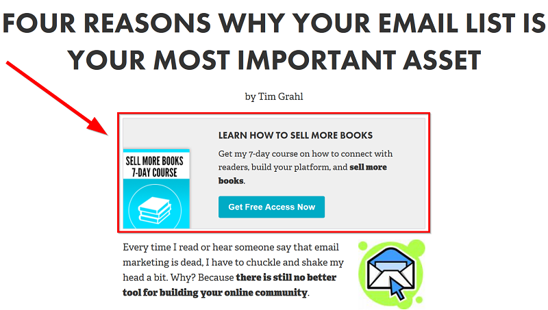
I prefer putting call-to-actions at the end of contents.
Web readers are more likely to read another content or perform a task after you’ve satisfied them with great contents on your website.
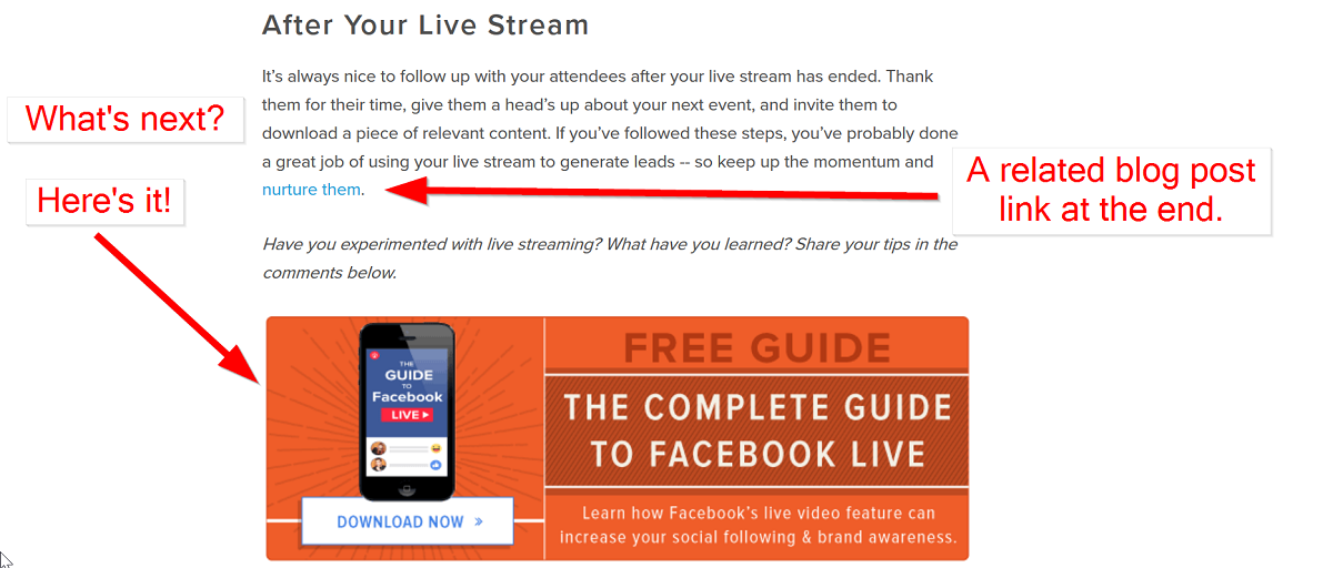
HubSpot practices this a lot.
In fact, they have a call-to-action at the end of every blog post published on their website.
Here’s an example:
Publish New Contents On A Regular Basis
Fresh content is good for SEO and good for building trust in your brand.
Regular fresh contents keep people coming back to your website.
For example, let’s say someone visited your website early last month. They visited again today only to see that you’ve published 5 new articles since their last visit.
If those 5 articles are really interesting, they’ll want to read all of them for fear of missing out.
For example, when you visit the Medium.com homepage, you’ll see a lot of interesting contents.
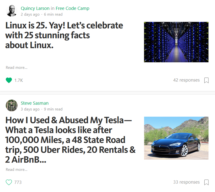
You can easily read more than 10 pages on a single visit, without knowing.
No wonder the bounce rate of the site is 31.96% according to SimilarWeb.

Consistent publishing keeps people interested on your website. And that improves your bounce rate.
Format Your Content For Readability
If your contents are hard to read and understand, your bounce rate will be high. There’s no doubt about that.
Reading your site’s content should be very easy.
One study found that users have time to read at most 28% of the words during an average visit, and that 20% is more likely.
If that’s the case, you can see how the format could be crucial for enhancing reader understanding.
When people read online content, they tend to skim.
There’s just so much content online that it’s completely normal to rely on skimming to ascertain which content is worth reading.
While content is king, there are plenty of things you can do to ensure that you give your content the best possible chance to be read and understood by the largest possible number of people.
Here are some tips to keep in mind when formatting your blog posts:
- Use sub-headers. Need to tell someone what your post is about in 20 seconds? Providing helpful headers will help those who are not sure what your content is about.
- Use numbered and bulleted list. Like I’m doing right now. I’m using a bulleted list. It’s ideal for readability because readers can quickly pick the points.
- Keep your paragraphs short. Short paragraphs are easy to read. Long paragraphs sap energy off the reader. Like this article, you’ll see that the paragraphs are pretty short, and the points are straightforward.
- Use simple words. Brilliant writing is simple writing. Using the big words doesn’t make you sound smart. If the average Joe can’t understand your content, then your bounce rate will be high. Write use instead of utilize. Write near instead of proximity. Write help instead of facilitate. Write start instead of commence. I’m sure you get the point. Everyone who understands these big words. But they know the simple words.
- Use visuals. Pictures and videos add quality to your content because web readers love them. An image can also serve as a resting place for the eyes. There’s a popular saying: “A picture is worth a thousand words.”
For example, here’s a screenshot of an article with a high readability.
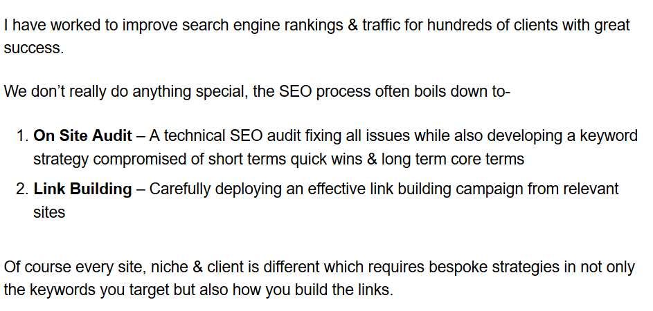
Notice how the paragraphs are short and simple words are used.
This is much better than what you see in the below screenshot:
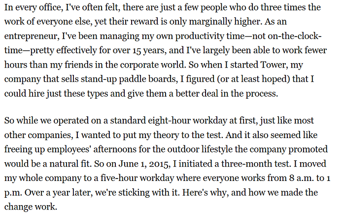
When you look at the above screenshot, you’ll notice that they are less white spaces, and paragraphs are long.
When you write like this, people are likely to get bored and bounce off your website. That increases your bounce rate.
Bounce rate may not look like an important metric in your Google Analytics dashboard. But it is, in fact, important.
Your bounce rate tells you a lot about what’s happening on your website.
If people are leaving your site without reading your content, then how do you get them to trust you, subscribe to your email list and buy your product?
A high bounce rate means these things are difficult.
So you better start improving your bounce rate today by using the tips in this article.
Thanks for reading, and please share this article with your friends on social media.
Related articles: best seo tools, invest in SEO, how to do smart SEO, how to improve search ranking, black hat SEO techniques
