Everyone knows the importance of first impressions.
But everyone doesn’t know that a first impression only takes 7 seconds upon meeting someone.
Websites are no different.
Visitors have less than 7 seconds to decide if they like your website and will want to become a customer in the future.
First impressions depend on many factors.
In this post, I’ll reveal the factors that have the most impact.
Let’s get started.
1. Get trust indicators
Trust is the first thing web users look for when they land on a site.
They ask themselves if they can trust a website.
If they can’t, they leave.
Trust is everything online.
Whether you’re a startup, a mom-and-pop shop, or a local service business, you need trust indicators on your site.
Your website is the face of your business online.
A well-designed website shows people can trust the business.
When you visit the site of ETQ, a footwear shop in Amsterdam, you trust the business immediately.
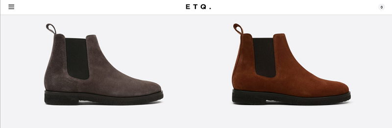
Their site was designed with care using a minimalist approach the business itself uses.
They have the kind of site you may want to buy shoes online.
Trust doesn’t stop at the beauty of the website.
Branding matters too.
Your website is an extension of your brand.
What are the core beliefs and colors of your brand?
They should be visible on the website.
For example, when you visit Apple’s website, it shows simplicity.
Simplicity is one of the unique attributes the Apple brand has.
They show that attribute through their website.
Web users should also feel secure on your site.
How do you achieve that?
By getting an SSL certificate installed on the site.
An SSL certificate will make your URL (website address) has “https://” in front of it.
For example, Apple’s site has “https://” in front of its address.
![]()
An SSL certificate keeps your website safe and secure.
Web users will feel safe to interact with your business online and give you their data.
2. Get a stunning responsive design
Above, I mentioned that web design plays a major role in helping people trust your site.
A good web design doesn’t just make people trust you. It also makes it easy for visitors to become customers.
How?
By getting a responsive design.
Responsive web design makes your web page look good on every desktop, tablet and smartphone device.
Many devices have different screen sizes.
Using a responsive web design makes the layout of your website match the screen size of every device out there.
Nearly nine-in-ten Americans today are online, and 77% own a smartphone.
You can’t make your website perfect for desktop devices alone.
If you want to get more customers on your website, it should be well-designed for every device.
More people are browsing the web on mobile devices than desktops.
Mobile internet usage surpassed desktop in 2016.
Getting a responsive web design will ensure that your website continues to convert visitors from desktop and mobile devices. For example, Maverick Restaurant, a Southtown San Antonio Texas Brasserie has a very simple website.
3. Make your call-to-action button noticeable
A call-to-action button is a message that prompts users to take action on your web page.
The call to action (also known as CTA) button is an essential part of your website.
A good CTA button should increase visitors’ interaction on your website and help you achieve your business goals like sales, email subscriptions, sign-ups and so much more.
Your CTA button should be noticeable at first glance without messing up your overall web design.
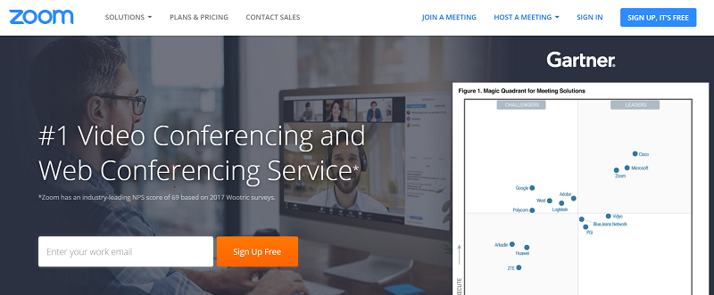
For example, Zoom’s CTA button stands out on its homepage.
If your CTA button isn’t instantly visible to visitors, then it has failed to achieve its goal.
For example, it takes time to notice Tableau’s CTA button.
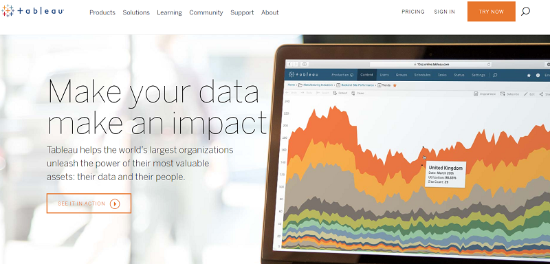
Their “See It In Action” CTA button has a tiny font, and it’s on a white background.
Shoeboxed is another example. They offer receipts scanning and expense reporting services. When you land on the website, the CTA button is one of the first things you notice. It gets your attention.
4. Don’t use stock photos
Businesses use stock photos because they are easier and cheaper.
But, in fact, it costs you more in terms of the potential customers you’ll lose because of them.
Using your own photos on your website adds a human factor to your brand.
Prospects will see the true colors of your brand.
Web users believe stock photography is fake, which influences the way they see your brand.
Thousands of businesses could be using the same stock photos that are on your website.
Clients and prospects may start to wonder if your business is truly unique and trustworthy when they see the same stock photos that are everywhere online.
Hire a professional photographer to take unique pictures for your business to use on its website.
The photographer should take various photos that represent your business.
Ask the photographer to take photos of your products, employees, clients, office, and more.
For example, Square uses real photos taken at the business place of a customer.

Avoiding stock photos will help your website appear unique and trustworthy to prospects.
5. Don’t use too much text on the homepage
There’s nothing wrong with creating lots of text content on your website through blogging like I’m doing right now.
Search engine bots can only read text content.
They can’t read videos and images, though, they learn more about visual content through the texts that surround them.
Your homepage is a special and different place.
Adding too much text content would be overkill.
The purpose of your homepage should be to turn visitors into customers.
Too much text would thwart that.
If you look at the homepages of most business websites, you’ll notice that they are short with little text content.
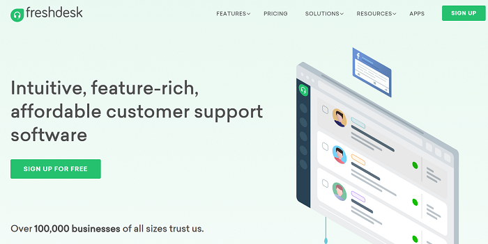
The homepage of Freshdesk, a customer service platform, is short with little text content.
The homepage is not the place to tell everything about your company, product, or service.
Although, all this information will be helpful. The homepage is not just the right place for it.
Too much text will distract visitors and dilutes your initial message.
Combine a little text with visuals like images and videos on your homepage.
Top Yacht Charters uses very little text on its homepage. Instead, the company relies on images to convey the value of its service to potential customers.
6. Adopt a hierarchy that enhances usability
Hierarchy is the difference between a site that influences the user flow and decisions and a site that just looks nice.
The headings and subheadings are a good place to implement the hierarchy concept.
A great heading hierarchy should lead users to the information they are looking for on your website.
For example, BigCommerce has a heading that says “Solutions.”
By clicking on “Solutions,” you’ll see subheadings that say “Enterprise,” “Small Business,” and “B2B.”
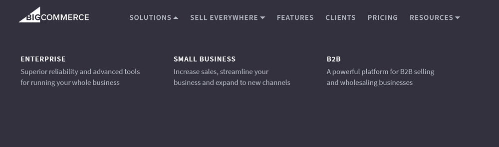
These subheadings show the different types of businesses BigCommerce serves.
So, if you’re a small business owner, you’re probably looking for a BigCommerce product for “Small Business.”
And if you’re a b2b business owner, you’re likely to click on the option for you.
BigCommerce has another heading that says, “Sell Everywhere.”
By clicking on this button, you’ll see options like “Ebay,” “Amazon,” “Facebook,” “Google Shopping,” “Square,” and “Buy Button.”
They offer more information about each service to help prospects better understand their products.
Use this kind of hierarchy in your heading too.
7. Display your business contact number
Customers expect to be able to reach a company through the phone. Not just email, social media, and live chat.
Customers get faster support on the phone than other customer service channels.
It’s also easier to build rapport with a customer when they hear a real voice than someone texting them on the other side of the computer.
If you’re selling expensive products or services, you need to make your phone number very visible on the site.
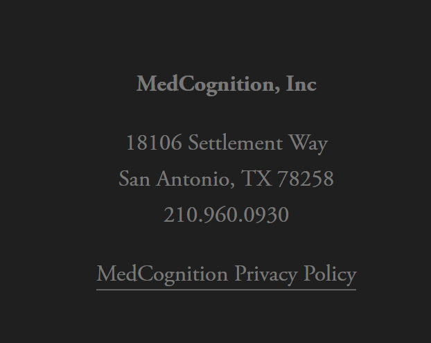
MedCognition, a healthcare startup based in San Antonio, Texas, displays their phone number on their site.
Google AdWords lets advertisers add phone numbers to their ads and enable calls directly from Google search results.
A study by Google found that 70% of users have called an advertiser directly from the results page rather than clicking on the ad.
If Google is allowing advertisers to receive phone calls from their ads, it shows that the biggest search engine in the world knows how important the phone is for businesses.
8. Get a favicon
What is a favicon?
Favicon is short for “Favorite Icons.”
It appears on the open tab label in your web browser to help you recognize a website.
If you can, use your brand’s logo as your favicon as Nike and Addidas do.
![]()
Using a favicon for your website will help you differentiate your brand from competitors and make it more polished and professional.
9. Make your website load extremely fast
The average web user can only wait 2 seconds for your site to load.
Visitors start to abandon your website if it doesn’t load after 2 seconds.
By 4 seconds, 25% of visitors are gone if the site is still loading.
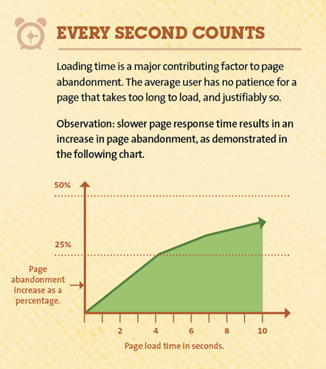
If your site’s loading speed is too slow, visitors may find it difficult to trust the business even if the website is well-designed.
Page speed is so important that Google has started penalizing slow websites by pushing them down in its search results.
Use a tool like Pingdom to test how fast your website loads.
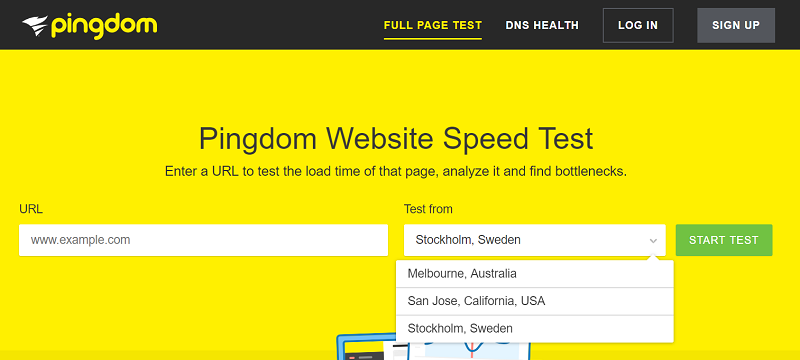
Anything above 2 seconds is bad.
Pingdom provides some performance insights I can use to make my website load even faster than that.
A lot of factors can contribute to slow loading speed.
Here are some of them:
- A poor web hosting service
- Bad WordPress (or website) configuration
- Big page size caused by images that are not optimized
- The presence of external scripts in your website’s code
10. Don’t rely on JavaScript too much
JavaScript can do everything on your website.
It can create an HTML element and change images. It is the jack-of-all-trades of the web.
But relying heavily on JavaScript is a bad idea.
Nothing beats simplicity on the web.
You can achieve simplicity with pure HTML and CSS.
You should only use JavaScript when it’s necessary.
Sites that are built with pure HTML and CSS codes are faster.
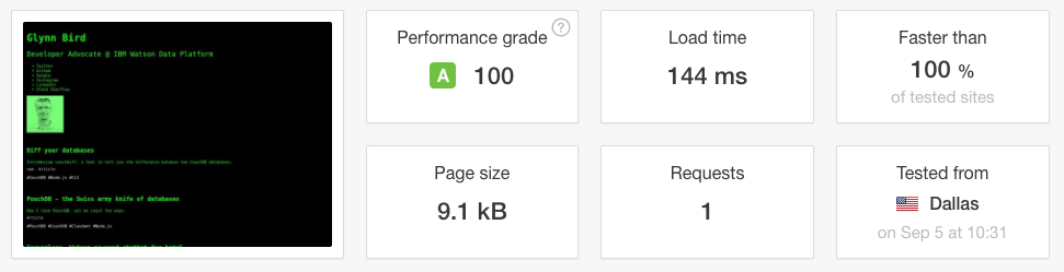
Glynn Bird, a developer advocate at IBM, created his website by modeling Tim Berners-Lee, the inventor of the world wide web.
He used zero JavaScript.
Glynn achieved a performance grade of 100 on Pingdom. His website loaded in less than a second and faster than 100% of tested sites on Pingdom.
Here are some things you should know about JavaScript according to Bartosz Góralewicz, the co-founder, and Head of SEO at Elevate.
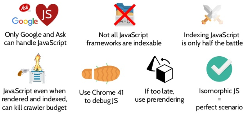
You’re probably not a web developer to understand JavaScript, but these are headaches you don’t want your website and business to deal with.
Ask your developer not to make your website rely too much on JavaScript.
Building most of your site with JavaScript will make it difficult for search engine bots to crawl and index.
What other ways can you make your site more appealing to web users and make more money?