No matter how good your website looks, it’s never perfect.
There’s nothing like the perfect website.
Yes, your site could look good, attractive and stunning, but there’s always room for improvement.
What kind of improvement am I talking about?
Before I answer that question, there’s something I must ask you:
Can you tell me what matters most to your business?
Don’t stress, I know what the answer is:
Profits!
Without profits, you’ll soon be shutting down. I know that’s a horrible thing you don’t want to hear.
Startups must thrive and make some money to get to the next level.
There’ll be a time a startup must grow and stop being a startup.

This guide will take you there.
This guide will help you take your startup to the next level.
This guide will help your startup dominate your niche.
You’ll take your startup forward by making continuous improvements that promote growth.
Welcome to the world of conversion rate optimization (CRO).
The improvement process I mentioned earlier is what CRO is all about.
But there’s more to it.
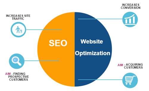
What Is Conversion Rate Optimization And Why Do You Need It?
Many digital marketing beginners often confuse CRO for traffic generating techniques like SEO and PPC.
I will like to emphasize that SEO and PPC will bring more visitors to your website. That’s what they do.
But CRO is entirely different.
CRO won’t generate more visitors to your website.
CRO is the practice of increasing sales and leads from your current traffic.
Let’s assume that your website received 1,000 visitors last month.
CRO won’t increase your traffic from 1,000 to 2,000 – that’s not what CRO does.
SEO and PPC (or any other traffic building strategies) can increase your traffic from 1,000 to 2,000 visits.
But let’s assume that your website received 50 leads from last month’s 1,000 visitors.
CRO is about increasing your leads from 50 to 100 or 200 from the same 1,000 visitors.
In this case, you’re not increasing your traffic. You’re only trying to increase your leads from the same amount of traffic your website is currently receiving.
But that’s not to say SEO (or PPC) are useless.
The Goal Of Conversion Rate Optimization
Every startup founder must be ready to roll up their sleeves and get involved in the conversion rate optimization process.
Optimizing for conversions should be the most important thing for every founder.
It’s a waste of time and money building a great product and designing a cool site only for prospects to end up going to competitors.
It could be that something on your website is turning them away.
You have to find out.
Until you find out, there’s no way you’ll build a successful startup. This is why CRO is very important, and it’s a BIG plus for you if you can understand how it works.
The primary goal of conversion is simple:
To increase revenue.
Or, to boost sales.
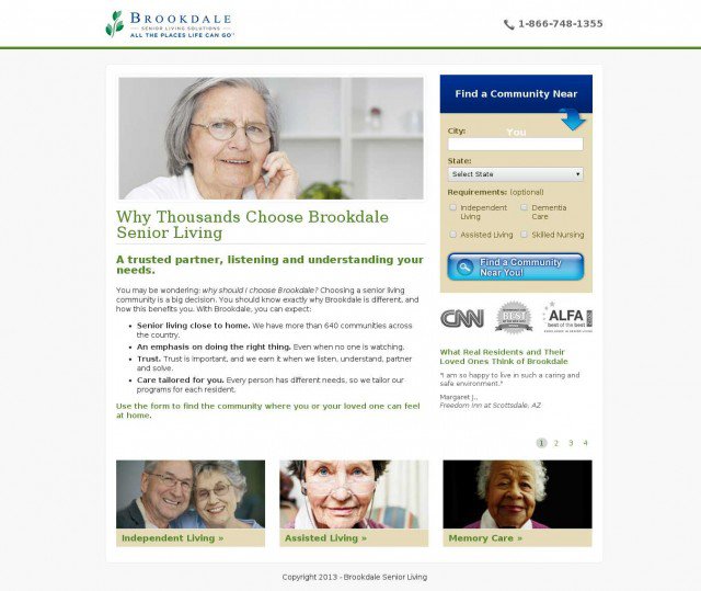
For example, BrookdaleLiving.com increased their monthly revenue by $106,000 just by replacing a video with an image.
What they did is simple:
BrookdaleLiving.com offers various community living solutions for senior citizens. Their initial page was unbelievably basic and had just the bare-bone structure with no graphics, testimonials or really any content at all that would encourage the visitor to convert.
After a complete redesign, they came up with 2 variations that were tested against the original basic page.
The first variation included a photo of an elderly woman. Like this:
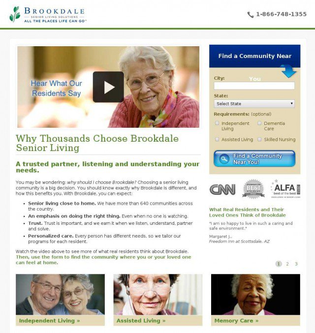
 The second variation had a 1 minute 56 seconds video instead of the photo.
In the video, many elderly people talk about their positive experiences with Brookdale. Everything else stayed the same.
 So what happened?
After testing all 3 designs (the original and both variations), it was found that the image version outperformed all others with an increase in conversions of 3.92%, while the video got just a 0.85% conversion lift over the original.
Although the 3.92% lift seems very modest indeed, it resulted in more than modest $106,000 additional revenue for the company.
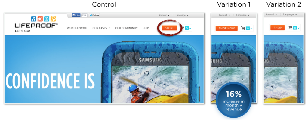
Lifeproof increased their monthly revenue by 16% just with a simple button CTA change.
By increasing your revenue from the same traffic your website is receiving right now, you’ll reduce your cost per customer acquisition. That’s a good thing!
Imagine you’ll have even more money to spend on traffic or pursue other goals that are crucial to the future of your startup.
Why You Should Never Copy Tests From Conversion Case Studies
Just through a Google search, you’ll find hundreds of conversion case studies.
I’ve shared a few conversion case studies so far in this guide.
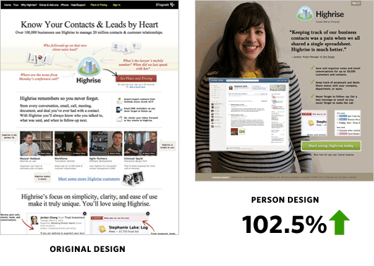
And for example, Highrise was able to boost their signups by 102.5% by testing a long page against a short page with the picture of a smiling woman in the background.
 There’s nothing wrong with reading conversion case studies.
They help you learn what other people are doing, and the results they are getting.
They help you broaden your perspectives and learn the best conversion optimization process, which I consider a good thing.
But you should never try to copy the result from a conversion case study.
Just because Highrise boosted conversion by making their landing page short and including the picture of a smiling woman in the page background doesn’t mean it will work for you.
There’s no guarantee that what someone else has done will work for you.
Highrise may be in a different niche.
They may have a design that’s different from yours.
Their wordings, site feel and a lot of other things may be different.
In fact, their target audience may be different too.
Therefore, what worked for them could be seriously worse for your startup.
Everything about your startup is different.
Conversion case studies are not a copy-paste solutions. (Although, the same goes for every other kind of case studies too).
If you’re running a cloud storage company and you read a case study about MailChimp’s amazing new landing page, then you want to copy what they did, you can’t assume that you’ll get the same results. Conversion optimization doesn’t work that way.
Copying what others have done is a path to destruction in the startup’s world.
You should learn from conversion case studies.
Rather than copying them, you should learn what worked for them and why it worked.
Okay, let’s use this case study that was published by Visual Website Optimizer as an example.
160 Driving Academy offers truck-driving classes.
Their conversion goal was to get more signups from their website.
So they tested a stock photo image (Variation A) with a picture of a real student (Variation B) on their landing page.
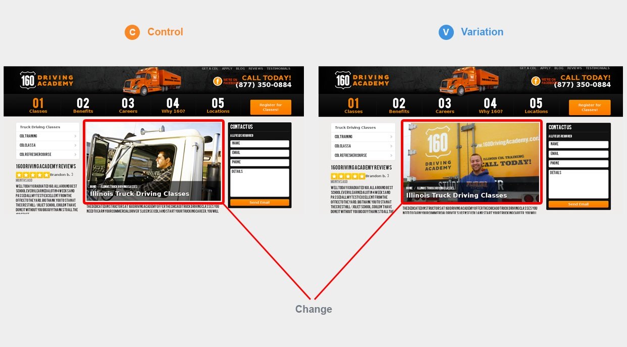
The result?
This page saw an incredible 161% lift in conversions just from changing the photo.
Now you might think that you need to be changing your photos so you can see big jumps in your site’s conversion, but this is not what you should do.
This truck driving school have a different target audience.
In fact, the reverse might work for you.
Stock photos could increase your conversions. You never know – that’s why you need to test.
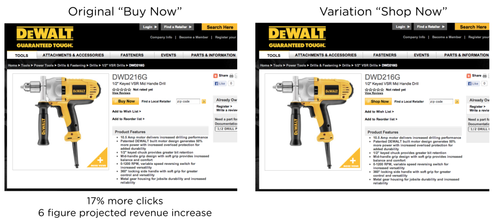
Another conversion case study I’ll like to reference here is this one posted by Optimizely.
They wanted to test just the CTA text on an eCommerce website.
The question was whether “Buy Now” or “Shop Now” would convert better.
Optimizely predicted that “Shop Now” would convert better because it was less committal and therefore less intimidating.
They were wrong.
Now, does that mean “buy now” is suddenly the best call-to-action for all ecommerce sites?
I’m sure your answer to that is no.
“Buy now” can’t be the best CTA for every kind of ecommerce website.
Even, an ecommerce giant like Amazon uses a different CTA.
For example, on this best-selling cordless rechargeable screwdriver page, they use the CTA “Add to cart.”
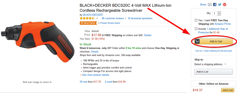
This is what works for Amazon.
Amazon could have a terrible conversion rate if they use “Buy now.”
So you should never copy the test results from any conversion case study.
What Conversion Experts Will Never Tell You About CRO
I’ll like to ask you a simple question:
What matters to a business between conversions and revenue?
Revenue, isn’t it?
Conversion experts are very good at painting exciting stories of how some businesses increased their conversion rates.
What they often forget to tell us is the revenue.
Here’s the harsh truth about conversion rate:
You could see a great positive increase in conversions and still realize a negative revenue.
CRO beginners are most likely to believe that a higher conversion will lead to a more revenue which is not always true
With this guide, my goal is to help you increase both your conversion rate and revenue – because, that’s what matters.
Let me give you an example, in case you don’t believe that a higher conversion doesn’t always mean more revenue.
I have a friend whose name I’ll call Victor.
He’s an ecommerce entrepreneur.
Victor runs an ecommerce store selling two kinds of water bottles:
A generic item worth $1 and a premium designer edition worth $100.
As a data-driven marketer, Richard wanted to know what’s happening on his website. So, he turned to analytics.
He decided that he’ll track three metrics to determine the performance of his ecommerce site.
Here are the metrics:
- Conversion rate
- Average order value
- Revenue Per Conversion
1. Conversion Rate
Here’s how to quickly calculate your conversion rate:
“Conversion Rate = Number of Checkouts/Number of Unique Visitors”
If your site receives an average of 1,000 visitors and 50 become customers, your conversion rate is 5%.
So conversion optimization simply means converting more of your current visitors.
Victor conducted an A/B test for the purpose of increasing conversion and here’s how the result looked like:
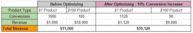 Victor’s conversions increased by 10% and his website that used to convert 1100 customers started converting 1210 visitors.
A 10% increase in conversion is big, but if you pay closer attention, you’ll notice that total revenue is now down as a result of this A/B test.
Even though conversion increased, the number of high paying customers had reduced.
2. Average Order Value
So Victor decided to turn to average order value (AOV) to get into what is happening on his website.
Here’s how to calculate your startup’s average order value:
“Average Order Value (AOV) = Total Revenue/Number of Conversions”
So here’s how the AOV of Victor’s ecommerce site looks like:
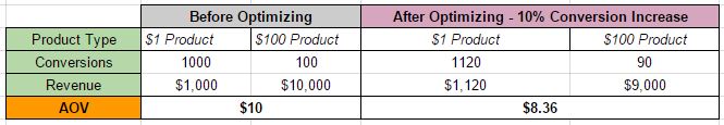 Despite the increase in conversion rate, Average Order Value had dropped by more than a dollar, resulting in an overall decrease in revenue.
3. Revenue Per Unique Visitor
This is the simplest and most effective metric to use when evaluating the performance of an A/B test.
It takes doubts out of the way. That’s why I’m a big fan of this metric.
Here’s how to calculate it:
“RPV = Total Revenue/Total Unique Visitors”
It tells you straightaway which variation resonates better with visitors and produce the best customers.
A friend of mine recently conducted a test that grew his email list by an average of 500 monthly, better than the control version which grew at around 200 monthly.
Which version produces the best customers?
The control version.
According to him, the control version wasn’t pushy and produces the best customers that buy his high-end products.
Let’s use a local service businessman like a Plumber as an example.
If version A produces 10 leads per day and version B only results in 3 leads per day.
Now assuming that phone calls from version A create 4 customers that earn you an average of $500 – that’s $2,000 in total revenue.
Then phone calls from version B result in 2 customers that earn you an average of $1,500, which is $3,000 in total revenue.
Which version is more effective?
While version A leads to higher conversions, Version B performs better when it comes to revenue.
You’ll want to go with the version that produces the most revenue because that is what matters to your business.
Before you conclude that any CRO campaign is successful, you must track revenue per visitor. That’s the only way to know if your CRO campaign generated an excellent result.
Tracking and improving your conversion rate is very important, but you should also not forget your revenue. It matters more than conversions, but many experts won’t tell you this.
 What You Must Know Before Getting Started With Conversion Rate Optimization
I’m sure that you can’t wait to conduct your first conversion test.
After reading some interesting CRO case studies, you want to increase your site’s conversions too.
Who doesn’t want more visitors turning into leads, and more leads turning into paying customers?
But, before you start running conversion tests on your website, there’s something you must do first.
What is that thing you must do?
It’s called data collection.
Data collection is an important part of CRO.
You don’t jump straight into conducting tests without data.
In fact, you could spend a few weeks or months collecting the necessary data you’ll need before actually doing your first test.
This is the point where lots of beginners get it wrong:
They jump straight into conversion optimization without collecting data, and soon you hear them complaining that CRO isn’t working for them.
You can’t run a test based on gut feelings.
You need real insights. Without that, you are just throwing spaghetti against the wall (aka Spaghetti Testing).

When a test is driven by real insights into the business, customer’s behavior and the usability of the site, the win rate would be higher.
There are two types of data in the CRO world:
- Quantitative data
- Qualitative data
Quantitative data is a good starting point. It gives you real numbers you can work with.
On the other hand is qualitative data.
Qualitative tells you more about your customers. It tells you what they like to buy, how they feel, why they buy, and a lot more.
You need both quantitative and qualitative data before testing anything on your website.
Note that it’s not a bad thing to have too many data.
If you spend a lot of time collecting real data, it’ll help you when you start testing your hypotheses.
CRO is difficult when you have too little data. You could be coming up with the wrong assumptions.
Now, the question is, how do you gather real data that will help you make the right guess?
The process is easy.
Google Analytics
Google Analytics is the most popular web analytics in the world.
Google Analytics is installed on at least 10 million websites, is used by 64% of the Top 500 US Retailers, 45% of Fortune 500 companies, and 55.9% of the top 1 million domains, as identified by Alexa.
Google Analytics is the first place to start from when gathering data.
Keep in mind that Google Analytics gives you quantitative data – real numbers you can work with.
The software tracks activities on your website.
For example, Google Analytics will tell you what’s generating the most traffic and conversions on your website.
The software also shows you where your best visitors are located.
To see that, look under your Audience menu to see Geo, and click Location.

And here’s how it looks like:
 And you can even select state you want to track:
 In the above screenshot, it shows that this particular site is getting more sales from California and New York.
This is a valuable quantitative data you’ll want to come back to during your tests.
Customer Surveys
Customer surveys is a good source of qualitative data.
Don’t forget that we need both quantitative and qualitative data.
By surveying your customers who bought your product, you’ll get to know what motivated them to buy. This will help you create better sales copies to test during your CRO campaign.
When you do this, you’ll convince more customers to buy from you.
SurveyMonkey is my favorite tool for running customer surveys. There are other options like WuFoo and Google Forms.
 After you’ve chosen your survey tool, now is the time to decide which questions to ask.
Each question has to be short and straight to the point.
Find the shortest way to ask a question without losing its intent.
You should also be ruthless when it comes to cutting unnecessary questions from your surveys.
Including a lot of unnecessary questions in your survey would prevent your customers from completing the survey.
It’s also important that you ask one question at a time.
Below are some good questions you should ask in your survey:
- In one sentence describe yourself.
- Where exactly did you first hear about us?
- How would you describe us to a friend? (Please write the exact words you would use.)
- How likely are you to recommend us to a friend?
- What would you miss the most if you could not use us anymore?
- What’s the one big thing we’re missing?
- What are your biggest everyday challenges?
- Please list the top 3 things that nearly stopped you from using us.
- Please list the top 3 things that persuaded you to use us.
- What could we have done to make your decision easier?
Tweak each question based on your product, service, or niche.
Heat map
Heat maps are great for analyzing the behavior of your visitors. They can lead to insights you can’t find using other methods.
They are three types of heat maps.
- Click heat maps
- Eye-tracking heat maps
- Scroll-tracking heat maps
Click heat maps are the most common type you’ll see.
Click heat maps present the actual actions taken by visitors in the form of mouse-clicks.
Eye-tracking takes things a step further.
This method uses the entire subset of visitors’ interactions, actually tracking cursor movements and producing a sequential path, indirectly indicating the eye-movement of the visitor.
For example, the baby’s face gets the most attention in the below picture. The pile of diapers? Not so much!
![]() Scroll-tracking heat maps are much simpler.
Scroll-tracking heat maps are much simpler.
You want to know how far down the page your visitors are scrolling?
You might have great call to actions towards the bottom of your page, but if no one’s seeing them, they’re worthless.
Scroll-tracking heat maps let you find exactly where your visitors are losing interest and where you should place the elements that have the most potential.
On-Site Surveys
On-site surveys, just like customer surveys helps you learn more about your prospects and customers.
The goal is still the same with both:
You want to learn as much as you can.
While customer surveys ask questions from people who bought something from your site (your current or past customers), on-page web surveys ask questions from people while they’re on your site (could be a variety of different segments).
Qualaroo is my favorite tool for running on-site surveys.
Here’s an example of an on-site survey:
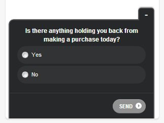
In fact, MotorAuthority rewards anyone who fills their on-site survey.

Your goal is to continue gathering valuable data you’ll need to create educated hypotheses before the testing phase.
Combining data from Google analytics, customer surveys, heat maps and on-site surveys will help you learn as much as you need about your customers.
How To Run A/B Tests That Give You Big Wins
I’ve mentioned the phrase “A/B test” a few times so far in this guide.
I didn’t explain what it means above because I don’t want to overload you with too much information at the same time.
It’s time to talk about A/B testing.
What does it mean?
A/B testing (sometimes called split testing) is comparing two versions of a web page to see which one performs better.
With A/B testing, what you do is pretty simple and very straightforward:
You compare two web pages by showing the two variants (let’s call them A and B) to similar visitors at the same time. The one that gives a better conversion rate wins!
 A/B testing is all about finding and going with the winners, and eliminating the losers.
A/B testing is the most important part of the conversion rate optimization process.
How do you get started with A/B testing?
Above, I mentioned the importance of gathering data before the actual testing.
Keep that point in mind because it’s the key to running a successful a/b testing, and boosting your business site’s conversion rates.
You need those data to decide what to test.
While quantitative data like the ones you get from Google Analytics are important, you should rely more on qualitative data when it comes to decision making.
No, I don’t mean that quantitative data are useless.
You need qualitative data more because it comes directly from your customers. They know what influenced them to buy more than you do.
By paying attention to their words, you’ll be able to predict what to improve and A/B test on your website.
Qualitative data will alert you to problems. It will also help you learn the WHY behind the WHAT.
Quantitative data will help you see where you customers quit, and who your most profitable customers are.
But to get deep into their brains, you need qualitative data.
I mentioned customer surveys and on-site surveys as good ways to get qualitative data.
But getting qualitative data isn’t limited to that.
You can also get qualitative data by picking up the phone and talking directly with your customer, or having a face-to-face meeting with them at a coffee joint.
 Anything that helps you get real feedback directly from your customers is always effective.
I recommend you stick with customer surveys and on-site surveys if you’re doing CRO for the first time.
After you’ve gotten a bunch of qualitative data on how your customers are behaving and you know why they are behaving that way, it’s time to move on to the next crucial step:
Predicting how to improve.
It’s time to brainstorm some solutions to your site problems.
What are the things you believe needs improvements based on the data collected?
Your predictions are just what they are: predictions.
But this is a much better prediction because it’s an educated guess based on the data you have with you.
It’s time to take each of your guesses out there and see if it would help improve your site conversions.
It doesn’t matter whether your guesses are right or wrong. You never really know until you test.
In fact, a wrong prediction still tells you something about your site visitors.
 Your goal is to find the big wins.
The big wins are what always lead to growth.
You may feel a bit down after an A/B test confirms that a guess is wrong, but you should never give up testing.
Running another A/B test could give that big win.
 Here are some good places to start from when running the first A/B tests on your website:
- Headlines
- Remove or add steps to your funnel
- Social proof (testimonials, customer logos, etc.)
- Calls to action
- Copy
- Long-form vs. short-form
- Layout
- Add and remove elements from a page
- Pricing (changing your pricing structure usually gives you a big win, but smaller tests like $37 vs. $39 can also help you grow)
- Purchase/signup bonuses
- Up-sells and cross-sells
There are a lot of good tools for running A/B tests, but I recommend Visual Website Optimizer and Optimizely.
Explaining The “New” Effect
There’s a common pitfall in CRO most experts often ignore.
It’s called the “new” effect.
What it means is that introducing something new to your website could outperform or underperform the old version in the short term simply because it’s new.
For example, you could introduce a new layout on your website, and suddenly conversions could increase because visitors likes the new design.
Then after a long time when visitors have gotten used to your new design, conversion may drop so low that it becomes worrisome.
In this case, the old version could even be performing better.
Your conversion may have been bumped up because of the new design.
The reverse is also true.
Many CRO beginners are likely to make this mistake.
The solution is simple:
Make sure you run an A/B test for at least 2 weeks before deciding to go with it.
When you run a test within the short term, you’re unlikely to get the perfect results. This is the reason why I recommend you let a test run for 14 days.
Digital Marketing Tips That Will Make You A Conversion Master
Learning CRO isn’t rocket science.
Even those considered as CRO experts had to start somewhere.
Nobody knows right away how to optimize websites as soon as they walk into the digital marketing world.
We’ve all had to learn some aspects. We’ve all had to put in the time and work.
Mastering CRO is easier now than it was several years ago. More learning resources are now available online.
Conversion rate optimization is just a part of digital marketing.
There are some digital marketing tips you’ll need to know to become a complete CRO expert.
So what are these digital marketing tips I’m talking about
Don’t Force Customers To Register Before Checkout
Most online shoppers don’t make it past the first step of the checkout process.
Here’s the reason why:
The first step of your checkout sets the tone for the entire checkout experience.
Start it on the wrong foot, and it’s where you’ll experience the largest drop-off of customers in the checkout funnel.
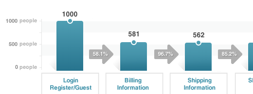 Even some ecommerce giants are making this mistake.
So what should you do?
The solution is simple:
Give shoppers the option to sign up with their social login. That way, they don’t need to create another account and remember yet another password.
According to a research published by WebHostingBuzz, 77% of web users believe social login is a good registration solution.
For example, ASOS gives you the option to sign up with any of the big social sites.
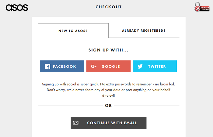 This saves you the hassle of needing to create another web account and remember another password.
Using social logins on your website will have a big positive impact on your site’s conversion rates because it makes it so easy for online shoppers to buy your product.
How To Hone Your CTA Button
Unknown to many, the CTA button is one of the most important parts of any site.
You may have created the perfect sales copy that increases customers’ interest in your product, but your CTA button could be reducing that same interest.
A great sales copy will increase conversions, but it won’t help much if your call to action is terrible.
There are 4 core things you must keep in mind when creating your call to action button:
- Text: Is the text easy to understand? Does it increase the desire to buy your product? Does it contain a lot of unnecessary words? Does it tell the benefits customers will get when they buy your product?
- Placement: Is your CTA higher up on the page, or below? Is it at the right place where people are likely to take action?
- Size: Is it easy for people to see your CTA? Is your CTA too big that it prevents visitors from reading your sales copy? Is it easy for people to recognize that it’s your CTA button? Is the size of your CTA suitable for mobile browsers?
- Color: Does the color of your CTA makes it stand out from the rest of the page? Are there plenty of white space around your CTA button? Have you A/B tested which colors give you the most clicks?
These are the four important factors you should always keep in mind when making your CTA button.
The word(s) you use in your CTA is very crucial to your conversion rate.
The text should motivate people to take action on your landing page.
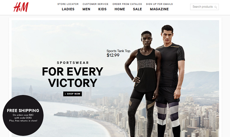
For example, H&M uses the word “shop” and “now” to encourage their visitors to take action right there on the spot.
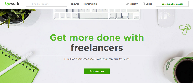
Upwork uses the action word “post” to persuade their visitors to act.
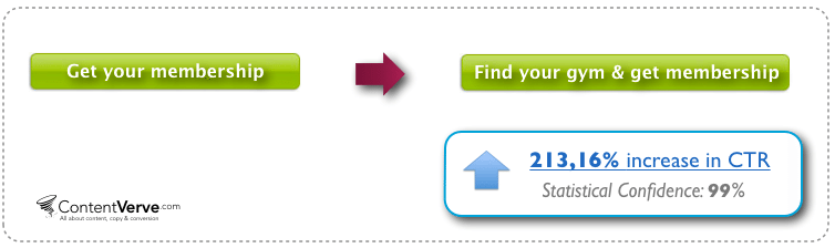
 Contentverve found that changing a fitness company’s CTA button text from “Get your membership” to “Find your gym and get membership” increased click through rates to the payment page by more than 200%!
This shows that the CTA button text is very important.
The location of your CTA button is also a key.
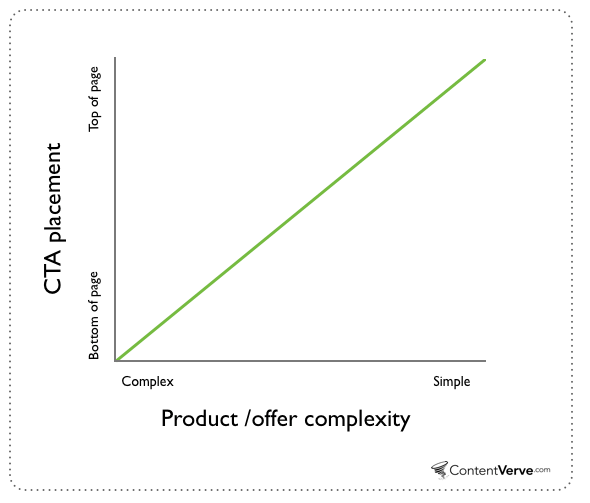
Landing page traditional practices say that you should place your CTA button high up on the page. This also depends on how complex your offer is.
If your product/offer is a bit complex, web users will need to read a lot of information before deciding to click your CTA button.
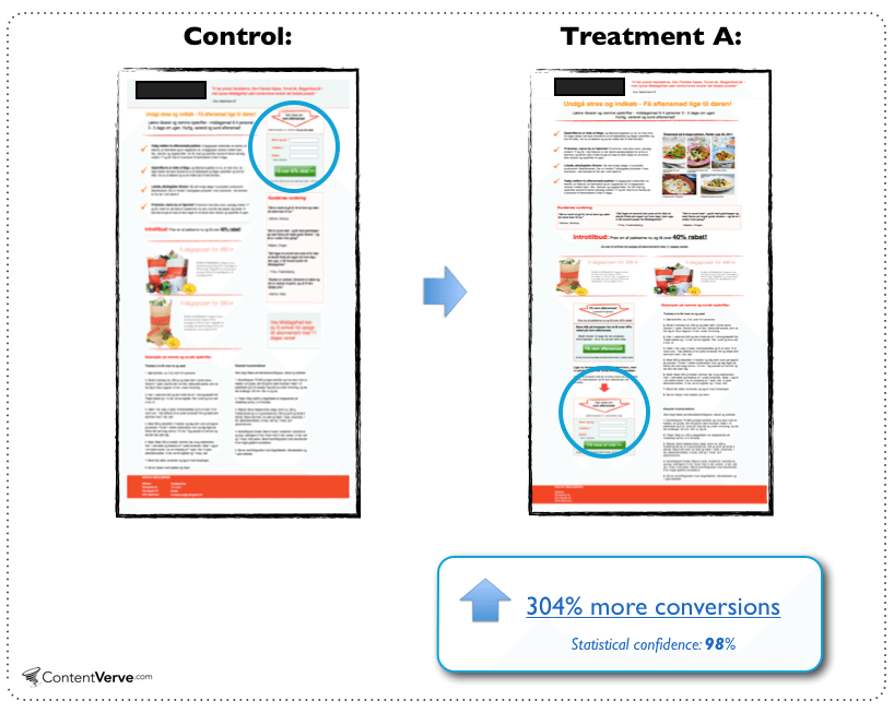
For example, Contentverve ran some testing on placement and found that there is a correlation between complexity and optimal placement.
They learn that having the CTA put at the bottom of a very long landing page perform than a version where the CTA is located at the top of the page.
In a case where your product is very easy to understand, web reader may not need a lot of information before they decide to click your CTA button.
Contentverve made a nice graphic that tells you where to place your CTA button.
The size of your CTA button matters too.
If the size of your CTA is too big, it could become so distracting to your site’s visitors.
And if the size is too small, your site visitors could have difficulties seeing your CTA.
You need an optimum size.
There’s no point telling you the perfect CTA size because it doesn’t exist.
You’ll also have to test and test to get a perfect size.

The large button looks out of place and too dominant for the page.
Color is also an essential part of the CTA button.
A color can lift up our mood or bring us down.
Color affect how people think and feel about things.
Various colors have different meanings in different cultures.
For example, white is the color of mourning and death in Chinese culture, but the color of death in Brazil is purple.
Yellow is sacred to the Hindus but represents sadness in Greece and jealousy in France.
In North America, green is typically associated with jealousy.
It’s said that in North-American culture the color blue creates a feeling of trust, but also encourages appetite.
Green supposedly means nature, freshness, growth, and money. Yellow brings with it sun and sunshine plus happiness.
Just like everything in the conversion rate optimization world, there’s nothing like the perfect color.
SAP found that the color orange boosted their conversion rate by over 32.5%.
Performable found that the color red boosted their conversion rate by 21%.
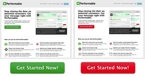 For me, I’ve found red to be a winner.
Red means a lot of things.
Red means stop. Red means danger. Red means hot. Red also means dominance.
The color you choose to use will depend on what your audience loves. That is why you need to test.
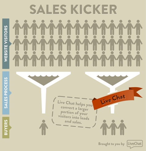
Adding A Live Chat Option Can Boost Your Conversions And Revenue
Sometimes, customers want to connect with a real person to answer their lingering questions.
Here’s where live chat comes in.
In a Q & A post on Quora, Szymon Klimczak, the CMO of LiveChat shares how having a live chat increases conversions:
“My knowledge comes from the fact that I’ve been with LiveChat for over 10 years now and over this time we’ve helped over 14,000 companies improve their customer service and increase conversion rates.
From my experience 10-30% increase in conversion rates can be expected on the transactional websites that have a reasonable amount of traffic that justifies using chat and if LiveChat is properly implemented. The exact numbers obviously vary depending on the case.
Historically, it is said that live chat conversion is about 10 times higher than the conversion of an average site. The average order value also increases thanks to chatting with the online rep while shopping.” – Szymon Klimczak, CMO at LiveChat
A study called “Making Proactive Chat Work” that was conducted by Forrester found the following:
Many online consumers want help from a live person while they are shopping online.
In fact, 44% of online consumers say that having questions answered by a live person while in the middle of an online purchase is one of the most important features a Web site can offer.
In a survey conducted by Bold Software and published on emarketer.com, here’s what they found:
- 63% of respondents who chatted said they were more likely to return to the site
- 62% reported being more likely to purchase from the site again
- A further 38% of respondents said they had made their purchase due to the chat session itself
All these show the massive effect a live chat option can have on your conversion.
One of the excuses people give when it comes to adding a live chat option to their website is that it will cost them more money. That’s not true.
In fact, having a live chat cuts down expenses and increases sales.
Some of the most notable cost savings are:
- Live chat reduces overall contact center costs by lowering average interaction costs.
- Increases efficiency by allowing live chat representatives to handle multiple chats simultaneously, thus reducing the need to hire more representatives.
Forrester reveals in a case study:
In 2008, Wells Fargo made a second attempt to leverage online chat to drive sales, and happily, this time the results have been crystal clear. High customer satisfaction scores and a double-digit increase in converted shoppers have shown the value once and for all of this technology.
There are a lot of good live chat services like LiveChat, Kayako, and BoldChat.
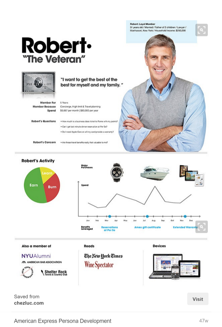
Create “Personas” Of Your Target Customers To Increase Conversions
What is a persona?
According to HubSpot:
Buyer personas (sometimes referred to as marketing personas) are fictional, generalized representations of your ideal customers. Personas help us all – in marketing, sales, product, and services – internalize the ideal customer we’re trying to attract, and relate to our customers as real humans.
Personas have been in use since the mid-’90s and since then have gained widespread awareness.
Personas will help you better understand your customer needs and interests so you can create contents that cater to their needs.
Personas also tell you where your target customers spend their time online so you can promote your contents at places where they will see it. This helps you get better leads on your website, which increases your revenue.
Even a billion dollar business like the American Express uses buyer personas:
Creating your buyer persona is super easy.
Google Analytics will provide you with the information you need like age, gender, and interests.
Now is the time to go back to those vital information you have through data gathering.
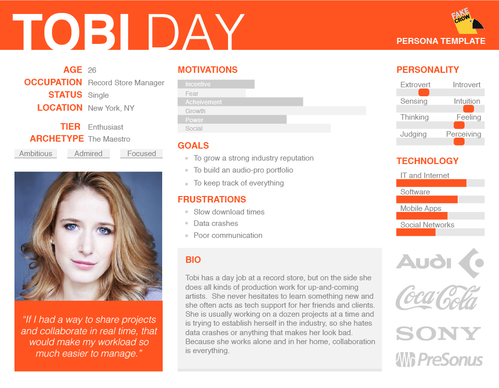
Below is a nice persona template that will save you time. You can download this template by clicking here.
Test Different Types Of Guarantees
Businesses have one goal in common:
To generate revenue for someone.
That’s why many businesses focus on creating compelling sales copies, split testing, content marketing, and many other things that are geared towards making sales.
We digital marketers (or startup founders) want web users to buy our products, but these people want some satisfaction, happiness, results – and it all boils down to one thing:
Avoiding regret.
If you’ve ever bought anything online, I’m sure you experienced a little doubt before you hit that “buy” button.
In fact, this doubt increases when you start filling your credit card details.
There’s one thing that completely removes doubt when buying online.
It’s called a money-back guarantee.
By offering a money-back guarantee, a prospect has no choice but to buy your product, except they aren’t really interested in your product in the first place.
This is probably the most popular guarantee in the world.
In fact, it’s so popular that it’s no longer viewed as a benefit, but as a right.
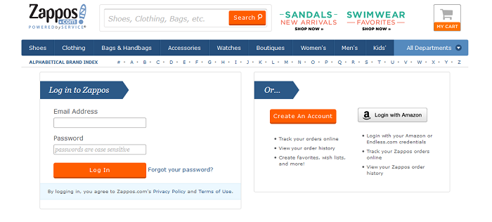
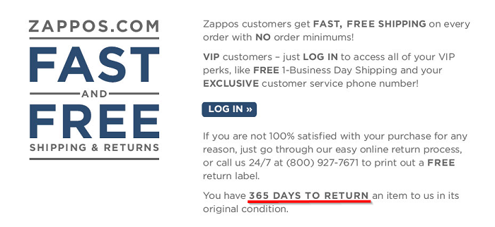
For example, Zappos shocked the world with their incredible 365 days return policy.
“Our best customers have the highest returns rates, but they are also the ones that spend the most money with us and are our most profitable customers.” – Craig Adkins, former VP of Fulfilment services at Zappos
Offering a money-back guarantee tells prospects that you truly believe in your product and service.
That belief alone could get you more sales.
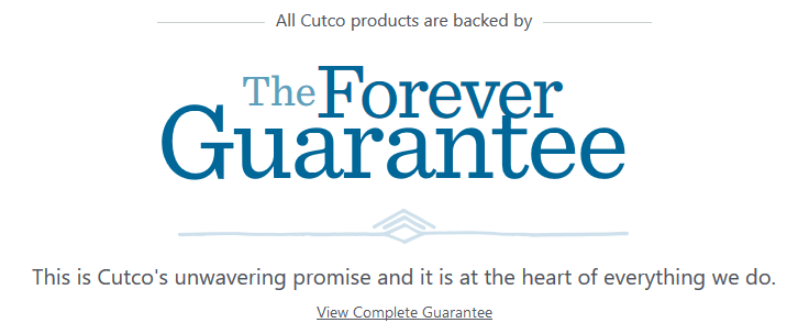
Cutco takes the guarantee concept further.
All the company’s products are backed by “The Forever Guarantee.”
Offering guarantees like this will boost your site’s conversion rates.
Put The Most Important Information At The Top Of The Page
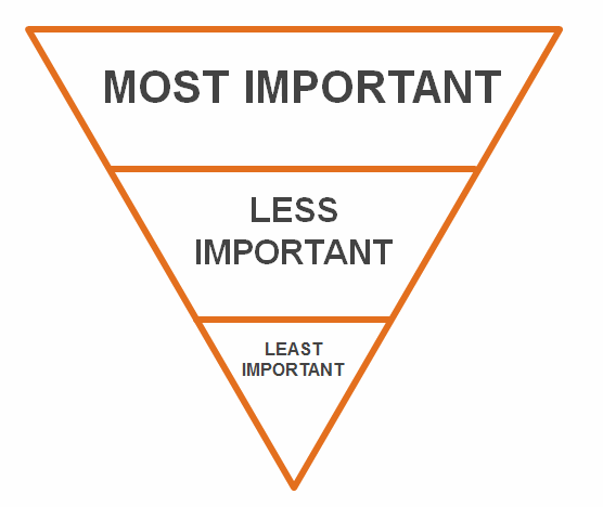
In journalism, there’s a common metaphor called the Inverted Pyramid.
Actually, it’s a style that’s often used in news writing.
The Inverted Pyramid writing style is very simple:
You include the most important information at the top of the article.
Then you start to include the lesser important information after that.
According to scientists, the age of smartphones has left humans with such a short attention span even a goldfish can hold a thought for longer.
Researchers surveyed 2,000 participants in Canada and studied the brain activity of 112 others using electroencephalograms.
The results showed the average human attention span has fallen from 12 seconds in 2000, or around the time the mobile revolution began, to eight seconds.
Goldfish, meanwhile, are believed to have an attention span of nine seconds.
With the rapid adoption of smart phones and tablet computers and the expansion of free Wi-Fi, hotspots, and reliable 3G we live in an always online world.
Now you have to say it quick, or your site visitors won’t get to where your call-to-action is.
If you frequently ramble and don’t get straight to the important points in the first paragraphs, chances are you’ll be losing a lot of conversions.
Your First Sentence Is Very Important To Conversion
Stephen King confessed that he could spend months and even years writing the opening sentences.
We’ve all heard the advice writing teachers give:
Open a book in the middle of a dramatic or compelling situation, because right away you engage the reader’s interest.
For example, when you go to the Dropbox website, here’s the first sentence you see after the headline:
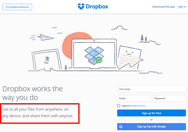 The first sentence on your homepage or landing page should tell a visitor specifically what you’re offering and who is it for.
The more specific you can be, the clearer and more compelling your message will be, and this helps you improve your conversion rates.
Use The Word “You” A Lot In Your Sales Copy
Words are the lifeblood of your landing page.
Whether it’s a text or visual content, you’ll still have to use words to convey your message.
A single word can either increase your conversions or reduce it.
Each word you use on your landing page should make it more compelling, stronger and captivating.
There’s a word that works like magic.
It gets people’s attention.
It increases their desire in your product.
It takes them through the checkout process.
What’s this word I’m talking about?
It’s the word “YOU.”
You have four seconds to grab the attention of web readers.
If you don’t, they are gone and may never return.
That’s why you need the word “you.”
With this word, your message feels more personalized. It talks to them rather than everybody.
You don’t want to make your sales copy sounds like someone who’s talking to a crowd. It should sound more like having a chat with a close friend at a coffee shop. That gives you an edge.
Use Powerful Words That Convert
“Join Us!”
“Sign up!”
These words are almost everywhere on the web.
Why?
They convert visitors.
As I noted earlier, you should A/B test any word before settling on it.
The difference between “joining” and “signing up” is the difference between fellowship and enlisting. A word changes the meaning, the mood, and the motivation.
You click on a headline because a single word strikes you.
You click a signup button because a word creates an emotion.
If you’ve experienced the above before, then you’ve seen some powerful words.
Social psychologist Ellen Langer tested the power of a single word in an experiment where she asked to cut in line at a copy machine.
She tested three different ways of asking, and recorded the results:
“Excuse me, I have five pages. May I use the Xerox machine?” – 60% said OK.
“Excuse me, I have five pages. May I use the Xerox machine because I’m in a rush?” – 94% said OK.
“Excuse me, I have five pages. May I use the Xerox machine because I have to make some copies?” – 93% said OK.
By including the word “because” which tells the reason why, people don’t seem bothered at all.
The takeaway here is, when you want people to take action on your landing page, you should give them a reason.
“Because” is just one of the powerful words that convert visitors online.
There are many others like:
- Suddenly
- Now
- Announcing
- Introducing
- Improvement
- Amazing
- Sensational
- Remarkable
- Revolutionary
- Startling
- Miracle
- Magic
- Offer
- Quick
- Easy
- Wanted
- Challenge
- Compare
- Bargain
- Hurry
- Proven
- Secure
- Results
- Backed
- Guarantee
- Endorsed
Powerful words are essential in the digital marketing world
Don’t Write Long Paragraphs
Great writers like Hemingway and Stephen King have mastered the act of addictive writing.
When you read their works, you’ll find it very difficult to put them down.
You just keep reading.
You keep wanting to know more.
What happened next and next, until you’ve devoured the whole book.
It works in the conversion optimization world too.
You must keep your site’s visitors on your website. Or else, they would go to your competitors.
One of the best ways to do that is to write short paragraphs.
Notice how my paragraphs are short and straight to the point?
They make you stay glued to this page.
Short paragraph holds the reader on your web pages.
It creates a nice flow that makes reading it so easy and amazing.
There are three things you should keep in mind when writing short paragraphs that get attention.
- Coherence
- Development
- Bridging
1. Coherence
Short paragraphs should hang together.
Point A should have a sweet flow to Point B while making internal sense.
Read this example:
“The conference was a blast!
I was tired when I got home, but I’m still glad I went. I picked up a book by Jane Smith, who I’ve admired for ages, and she actually signed my copy.
I learned a lot, too.
It’s going to take me a while to go through my notes and see what I can apply.”
Noticed how the paragraphs failed to connect with each other.
Now, compare it to this example:
“Despite being tired when I got back from the conference, I had a blast there.
I learned a lot, took lots of great notes that I can now apply to my situation, and I even met Jane Smith, a long-time idol of mine.
(She even signed my copy of her book!)”
Noticed how the first paragraph flows to the next.
Writing like this makes your sales copy more compelling. It keeps prospects on the page.
2. Development
Development means each point you make is fully fleshed out.
You can do that in many ways:
- Chronological – Write about events in the order that they happen.
- Location – Describe elements ranging from smallest to largest or vice versa, “panning” from one area to another, etc.
- Example – Clarify what you mean by giving illustrations.
- Compare and contrast – Discuss how two or more things are the same or different from each other.
- Process steps – Give a sequential series of steps to achieve an outcome.
- Analysis – Discuss the different implications of the paragraph’s topic.
When you write with development in mind, your paragraphs would have nicer flows.
3. Bridging
Bridging is the powerful technique for transitioning between points and paragraphs.
Bridging solidify your writing flows.
Here’s how bridging works:
You can talk about something in one paragraph, then expand on it in the next paragraph.
You can repeat words to create a sweet flow and rhythm in your paragraphs.
For example, Martin Luther King used this strategy a lot in his famous speech:
I have a dream that one day on the red hills of Georgia, the sons of former slaves and the sons of former slave owners will be able to sit down together at the table of brotherhood.
I have a dream that one day even the state of Mississippi, a state sweltering with the heat of injustice, sweltering with the heat of oppression, will be transformed into an oasis of freedom and justice.
I have a dream that my four little children will one day live in a nation where they will not be judged by the color of their skin but by the content of their character.
Bridging can also be used to create a list where the attention flows to the next paragraphs.
Bridging is the reason why lists posts are successful because readers always want to know what’s next.
Coherence, development, and bridging may all sound like a writing advice that teaches you how to become a better writer.
These techniques are also very useful for keeping readers on the page.
You’ll need them to create sales copies that increase conversions.
Or, maybe you’ve hired a copywriter to do their job.
Having a deep understanding of how this works will help you evaluate the work of your copywriter.
Add Customers’ Stories To Your Landing Page
Have you ever landed on a web page that you don’t want to leave?
While you’re on the page, you noticed something happening in your environment, but you didn’t pay attention.
You heard your phone ringing, but you didn’t answer the call.
And you let your coffee got cold.
I can bet that the web page has a story in it.
At that point, you’re living in the story. You had become part of it.
Our brain love stories. In fact, it craves stories.
Through storytelling, you can plant ideas, thoughts, and emotions into the minds of your visitors.
By telling a great story on your landing page, you can change what your visitors think and feel towards your business.
Storytelling is a powerful marketing tool.
You’ll be missing out on a lot of potential sales if you’re not using it on your landing pages.
One of the best storytelling techniques you can use is to show your customers’ stories on your sales page.
It could be a short, written testimonial.
It could be a short video (even better).
The best storytelling telling format is the one that starts with a story of human struggle and an eventual triumph.
This format is very effective when you want prospects to keep thinking about your product long after they’d left your landing page.
This format motivates and persuades people to buy.
By using this storytelling technique, your landing page will capture people’s hearts – by first attracting their brains.
Marketers have been using storytelling to sell since many centuries ago.
Legendary copywriter Joe Sugarman suggested that readers should feel compelled to read your ad as if they’re sliding down a slippery slide.
“People love stories, and one of the really good ways to relate to your prospect is to tell a story. (…) a story can be invaluable and creates an emotional relationship of bond that keeps your prospect riveted and listening.”
A good story will increase the desire for your product.
In fact, a good story will make a boring product more fascinating.
Use Trust Seals On Your Website
When an online shopper lands on a website, a substantial amount of trust needs to be built in order to get the sale.
With a lot of websites on the internet, it’s difficult to know which ones are safe before entering their personal information and payment details.
They are a lot of scams happening every day on the web. Web users are afraid of falling victims to fraudsters. They need to be vigilant!
What is a trust seal?
“A trust seal verifies to visitors that a website is legitimate. Data is collected by the third-party trust seal company that confirms that the business is authentic.”
In fact, some trust companies add an extra layer of protection by offering insurance to be paid out in the event that the transaction becomes fraudulent.
So this assures web visitors that they are dealing with a real business, and should feel safe when inputting their payment details.
Web research group, Baymard Institute conducted a site seal survey that generated over 1,286 responses.
The following site seals were tested, and the respondents had to click one of them as an answer to the following question:
Which badge gives you the best sense of trust when paying online?
Here’s the result of the survey:
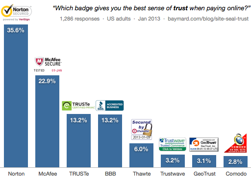 The two most trusted site seals, by far, are from anti-virus software brands.
It would seem likely that people recognize these brands better and associate them with security, and therefore trust their site seals (which include the company logos) more.
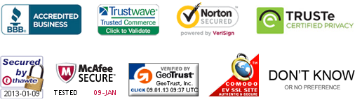
For me, I’ll advise that you display the top three seals on your website, though this also depends on the kind website you run:
- Norton SSL seal to indicate an encrypted connection.
- McAfee seal to indicate a clean, non-infected “hacker safe” site.
- And BBB Accredited or TRUSTe seal for establishing trust in consumer relations.
When you have these top three site seals on your website, you’ll feel more trusted, and your conversions will increase as a result.
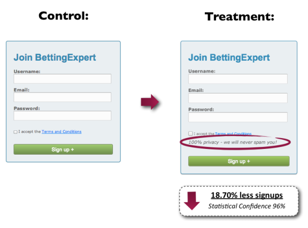
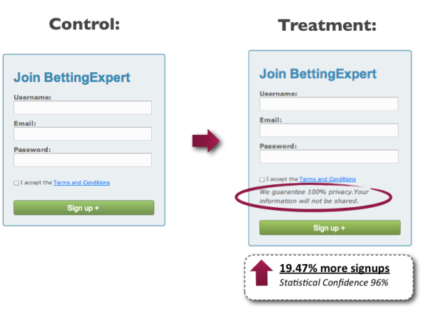
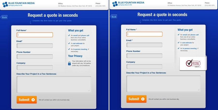
For example, Blue Fountain Media cited a 42% increase in conversions with their A/B test of a VeriSign seal (see their A/B test variations below), and US Cutter reported conversion lifts of 11% with the use of a Norton trust seal.
Address Important Sales Objections
If you’ve written the most tantalizing and engaging sales copy, but it fails to address common sales objections, then your sales copy isn’t complete.
Sales objections are the biggest obstacles to making the sale.
Objections are inevitable.
We experience them everyday especially when it comes to decision-making, even with the little decisions.
So how do you handle sales objections?
My favorite strategy for handling sales objections is called the LAER framework.
LAER is an acronym for Listen, Acknowledge, Explore, and Respond.
Listening is the most important skill when it comes understanding someone’s objection.
Don’t interrupt. Just listen.
You’ll need to go back to the information you gathered during the on-site survey phase. This data will help you come up with some sales objections you should address in your sales copy.
Then acknowledge.
It’s so important that people know that what they’re saying doesn’t fall on deaf ears.
By acknowledging the objection, you say something like “I get it.”
The next step is to explore.
By exploring, you ask questions that allow you to better understand why people are objecting.
Here’s where you’ll uncover the things that make your prospects feel uncomfortable to buy your product.
The final step of the LAER framework is to respond.
Now you have all the information you need to respond to the objections your prospects have.
The key here isn’t to tell someone why their way of thinking is wrong, but to lay out all the facts and let them determine what makes the most sense.
When you handle sales objections using the LAER framework, your conversion will increase, and your sales will shoot up as a result.
The Biggest A/B Testing Mistakes You Must Avoid At All Cost
If you’ve read this far, you’ve gained some golden nuggets in this guide.
You can now consider yourself as a conversion optimization expert.
But there’s one thing you must know:
Mistakes.
Mistakes are pretty uncommon in the CRO world, and even the experts make them.
A single mistake could cost a lot of valuable time and resources.
By knowing how to avoid common conversion optimization mistakes, you’ll get big positive results for your startup.
What are the common CRO mistakes?
Running Too Many Tests at The Same Time
It’s generally believed that the startup who runs the most tests will gain the most insights about customers.
That’s true.
The more tests you run, the more you learn.
For this reason, some startups run too many tests at a go to save time.
For example, they are run tests on the home page, cart page, product page, all at the same time.
This is a very silly mistake that may look like a wise one. And you must avoid it if you want to run A/B tests that give you real results.
There’s no shortcut when it comes to A/B testing.
Ignoring The Small Gains
Maybe you run a test that brought in a 1% increase in conversion, so you think the test doesn’t worth it.
Many times I’ve heard people say something like this:
“That’s way too small of a gain! I won’t even bother to implement it.”
That’s a wrong way to approach conversion optimization.
In the CRO world, those tiny gains mean a lot.
CRO works much like compounding.
New tests build upon previous tests and continue to improve your results.
The better and more positive results you get in the short term, the more your revenue will continue to increase over the long term.
Imagine you run like 30 great tests within a 12-month period, and those tests brought in a combined 30% more sales.
One test may not bring in much.
But if you continue to run tests that give you better returns, you could be increasing your startup’s growth by as little as 5% each month – that’s compounding interest.
Failing To Run Tests At All Times
A single day without a test is a wasted day.
You’ve just missed an opportunity to grow and learn more about your customers on that day.
Continuously running new A/B tests help you learn new things, what work, and why.
You could become a little bored with A/B testing after getting few negative results from your first few tests.
You could also become complacent after getting big positive results from your first few tests.
The moment you stop learning about your visitors and customers, that’s the time you start losing opportunities to become a leader in your niche and further cement your current position.
Doing A/B Testing On A Site That Doesn’t Have Enough Traffic
When I was new to the digital marketing world, I’d change my site title, something in my sidebar, footer, and navigation almost everyday to see if my affiliate sales will increase.
You know what?
Nothing happened.
I only started making money with my first site when I began to put in the work and drove traffic to it.
My traffic surge, but my earnings weren’t increasing that much.
So I went back to change something in my sidebar and made the navigation cleaner.
Do you want to know what happened next?
My earnings increased by over 200%.
I was surprised.
I couldn’t believe that my website could make that much money within a very short time.
That’s A/B testing of course.
A/B testing only makes sense when your site is already seeing some worthwhile traffic.
Don’t waste your precious time running A/B tests when your website is barely receiving 500 visits per month.
Your time would be better spent doing SEO, AdWords, content marketing, link building, guest blogging, Pinterest marketing – just anything that would bring in relevant traffic to your website.
How To Make The Perfect Landing Page
I believed that I’d mentioned some amazing tips already in this guide that can help you create the perfect landing page.
But my goal for creating this guide is to make you a complete conversion expert. Not half. Complete!
Your landing page is an essential part of the conversion optimization process.
If your landing page sucks, you’ll see a very low number of leads. The quality of the leads generated could also be low.
I want to help you avoid these. That’s why I’m making this important point.
A few months ago, the director of a local business in Los Angeles came to me and asked why their conversion rates are so low despite spending an enormous amount of money bidding on all the keywords that are relevant to their business.
After just 5 minutes of research, I found the problem:
Their landing page was terrible.
In fact, some of the keywords they were bidding on aren’t relevant to the content on the landing page.
I made sure the intent behind each keyword matched the content on the landing page. I created more landing pages to accommodate various kinds of keyword they were bidding on.
The result?
Within a week of the project, their conversions shot up like a rocket.
They were amazed!
They couldn’t believe they can receive such massive calls and businesses in their service areas.
Many startups are losing a lot of their marketing dollars due to terrible landing pages.
A good landing page doesn’t have to be attractive.
It just has to do one thing:
Convert more visitors than the previous landing page.
So how do you create a perfect landing page that increases conversions?
The process is simple.
Here are the elements a perfect landing page must have:
- A nice looking headline
- Clear and concise sub-headlines
- Flawless grammar
- Trust indicators
- A strong call to action
- Very few number of links
- Presence of images and videos
- Test, Test, Test.
Now let’s talk about each element.
1. A nice looking headline
The headline is the first thing visitors see as soon as they land on your page. You have to make it catchy that visitors can’t wait to read your first sentence.
 A lot of work goes into creating the headline.
Don’t just toss words into your headline and expect it to convert.
The headline must give visitors a sense of what to expect if they stick to your landing page.
If you’ve chosen the right keywords, you must also ensure that they match your title.
If you have various keywords with different intents, you may want to create landing pages that match each keyword.
For example, if you run a restaurant that’s based in City A, you could be bidding on keywords like “the best restaurant in city A.”
Your title could be something like “We Are The Best Restaurant in City A.”
In this example, the intent matches the keyword.
But if city B is just 5 minutes away from city A, you may also want to bid on a keyword like “the best restaurant in city B” because your restaurant is not that far.
In this case, you’ll need a separate landing page which matches the keyword “the best restaurant in city B.”
Your headline for this second landing page might appear like this “Our restaurant serves the best food. We are just 5 minutes away from you.”
The potential customer in city B won’t feel lost when you do this. And you will have more customers in city B patronizing your business.
2. Write Clear And Concise Sub-Headlines
It’s one thing to get someone to read your article because of a catchy title, and another to get the reader to continue reading your article.
Sub-headers help you keep the interest of the reader alive.
As I’ve said earlier in this guide, web readers have a short attention span. They often scan contents instead of reading them.
Using a lot of sub-headings is very effective for engaging with web readers.
So instead of just saying random things in your sub-headings, you should use them as opportunities to communicate the value of your business to visitors.
3. Make Sure Your Page Is Free From Grammatical Errors and Typos
Typos happen.
No matter how vigilant you are, no matter how many times you run spell check, no matter how many times you proofread, one of those suckers will slip through.
But when they do, it could cost you thousands of dollars in revenue.
 When prospects see typos spread all over your landing page, they could begin to question your ability to deliver the promise.
Allowing one typo could still cost you some sales, so it’s better you prevent it.
How can you prevent typos?
It’s simple. You only need to follow these rules:
- Use simple language
- Be slow and careful
- If you’re not sure about what to say, don’t say it
- When writing, always look things up
- Know where you can screw up
- Don’t write when you’re tired
- Don’t be afraid to use the dictionaries
- Get help from your educated friends who are willing to double-check things for you
By following these rules, you’ll be able to avoid stupid grammatical mistakes such as this:
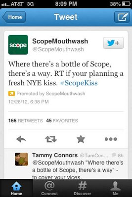
Imagine a promoted tweet like this has a typo. How is it going to convert Twitter users into buyers?
No way!
I still see terrible mistakes like this on landing pages.
4. Use Trust Indicators On Your Website
I talked about trust seals earlier in this guide. But trust is more than just having trust seals on your website.
Even if you have trust seals, it doesn’t automatically mean visitors will convert on your landing page.
They are other trust indicators you need to convince visitors.
For example, and ugly looking website shouldn’t expect to convert any visitor.

Lack of customer reviews, testimonials feedbacks and endorsements will make it hard for people to trust you.
A lack of certification logo also makes it difficult.
Your contact details like phone number and office address should also be visible somewhere on your website.
5. A Strong Call To Action
Keep this mind:
Your call to action is one of the most important elements on your website.
It has to be strong and compel people to take action on your landing page.
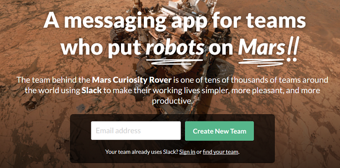
When you visit Slack, for example, their call to action is simple:
“Create New Team.”
6. You Should Have A Very Few Number Of Links
Don’t overload your landing page with lots of links to different places.
There should be only one link on your landing page, and it should only be your call to action.
If they must be a second link, it should be your secondary call to action. This means it’s another action visitors might want to take that would still lead to conversions.
7. Include Pictures And Videos On Your Landing Page.
People love visuals.
Our brain craves them.
In fact, the human brain process visual information 60,000X faster than text.
 People hardly buy without seeing these days. That is why visual is an invaluable tool for increasing conversions.
After online retailer, BrickHouse Security added an automated drop-down menu of textual results that appear when shoppers enter terms into its site search window, it boosted conversion rates.
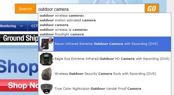
Here’s what they have to say about this:
“With the product images in the site search drop-down window, we get a 100% lift in conversion rate among shoppers who use site search.”
Just like image, adding a video can use boosts your conversion rates.
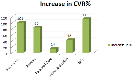
Treepodia says video is one of the few strategies that seems to work well regardless of the category in which it is deployed.
The following chart shows the conversion rate increases that were witnessed for shoppers who watched product videos:
8. Test. Test. Test.
Images can increase conversion rates.
Videos can also increase conversions.
You just never know until you test everything.
To learn more about landing page, you may also read a complete guide to landing page optimization.
So start testing today and you’ll grow your startup almost overnight!