At the back of every great marketing strategy is a basic knowledge of human behavior.
Understanding how people think, make decisions and interact will give you a big edge ahead.
Every day, you’re being bombarded with people trying to sell you stuff.
The big brands, the small businesses, TVs and websites.
They trick you into buying their stuff and even paying more for it.
Apple uses psychology in their marketing. A lot.
No wonder iPhone users feel classic, expensive and stylish compared to others.
TV hosts use laughter. They are tricking you.
They don’t want you to touch that dial.
Because if you touch it, you’re gone. And you may never return to their channel.
Great marketers use psychology.
Do you want to become a great marketer?
Here are some great psychological marketing tactics you can start with:
Don’t Use Generic Words In Your CTA
The call to action is the most important part of a landing page.
It is what people must see to start a free trial, subscribe to your email list or buy your product.
If people don’t see it, they don’t convert.
The words that appear in a CTA button matters a lot.
Don’t use generic words. They are everywhere.
Using them doesn’t make your offer different from the millions of other offers on the web.
Look at the call to action that appears in the below screenshot:
Almost every product on the internet could use those words.
They are generic.
They don’t talk to you.
Therefore, they are ordinary.
Most CTAs ask you to give them something.
Things like email, money or energy. Things like these cause resistance in mind.
Words like “Submit,” “Buy,” and “Download” create high resistance in the minds of customers.
They are like chores.
Who likes chores?
For example, Applause offers usability testing solutions.
Take a look at the CTA button of one of their landing pages:
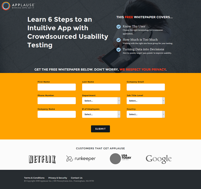
That form is frightening. And the CTA makes matter worse.
The CTA is boring. Too generic. It can be better than that.
Most forms online use the word “Submit.”
I doubt you fill every form you see on the web. That word gives you more reason not to fill the form.
The word you use should match the landing page.
This Trulia’s landing page is a perfect example of what I mean.
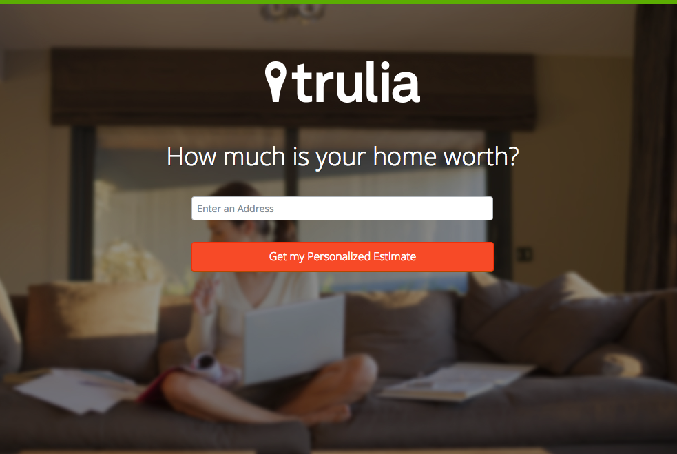
They used the CTA “Get My Personalized Estimate.”
That’s the reason why visitors of this web page are there in the first place:
They want to know how much their home is worth.
By seeing the CTA, they are more likely to fill the form.
They could have used a CTA like “Submit.” That wouldn’t persuade visitors to fill the form.
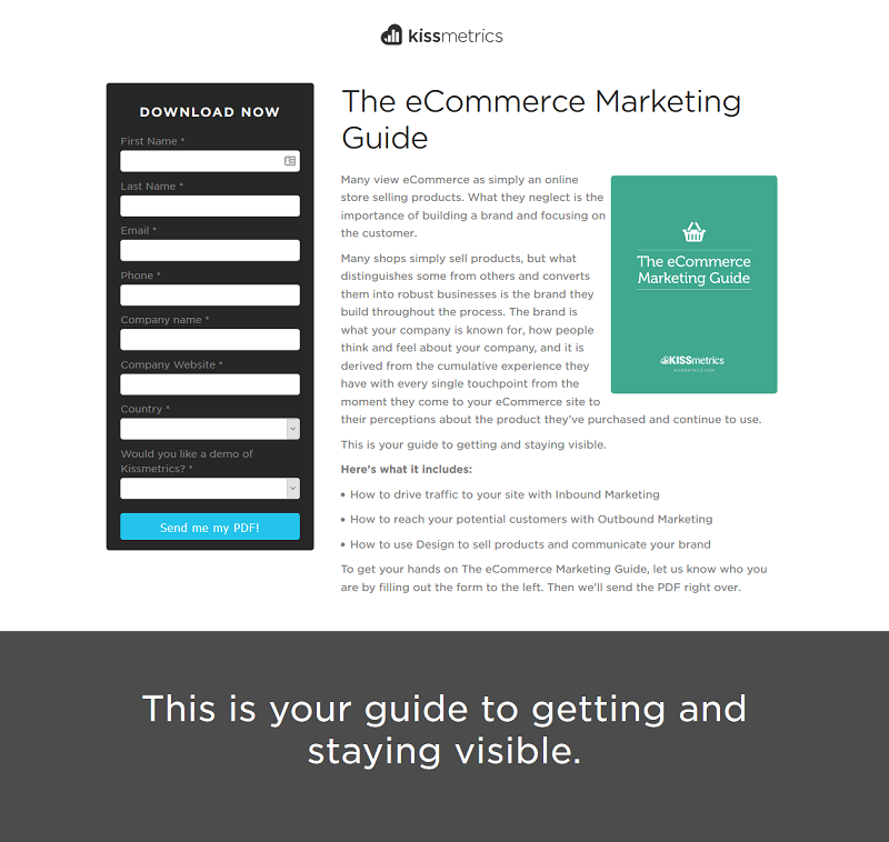
KISSmetrics use the same strategy:
When iMPACT changed the CTA phrase of one of their landing pages from “Free Download.”
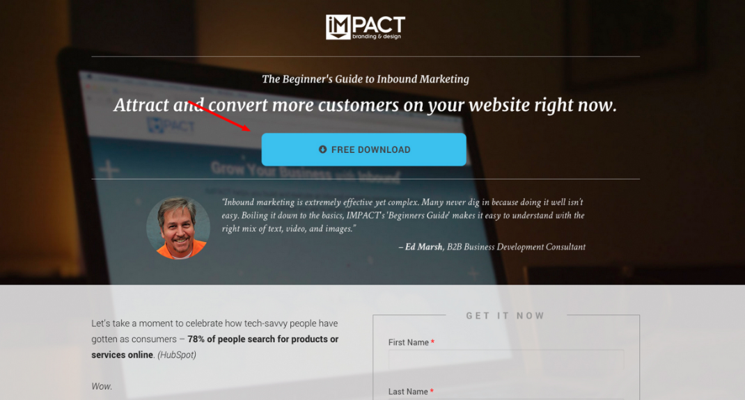
And make it more personalized to “Show Me How To Attract More Customers.”
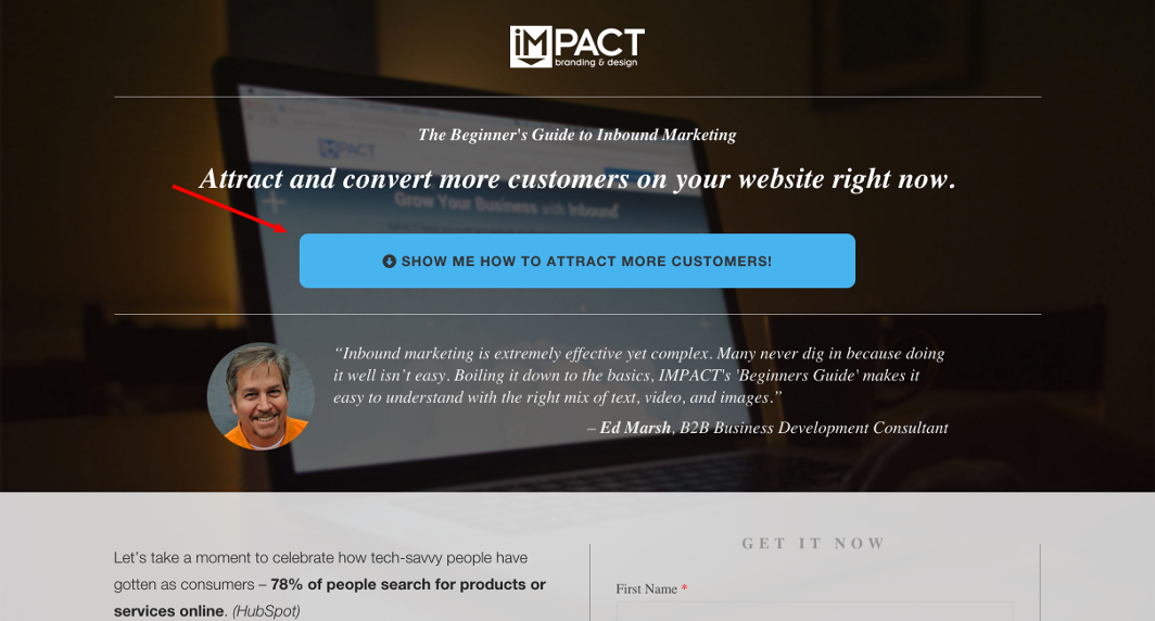
After only one month, their conversions increased by 78.5%.
Put yourself in customer’s shoes and write a CTA that talks to customers on a personal level.
It’ll make a significant psychological impact on how and what they think about your offer.
Direct Users To Your CTA
There’s another essential thing you must keep in mind:
Placements.
Where you put your call to action is critical to the success of your landing page.
A poorly placed CTA won’t get good results.
The placement of the CTA can have a big psychological impact on visitors.
The offer’s complexity is the biggest factor that determines where to put the CTA button.
Contentverve ran some testing on placement and found there is a correlation between complexity and optimal placement.
They found that placing the CTA button below the fold does better than putting it above the fold.
In fact, it increased conversions by 304%.
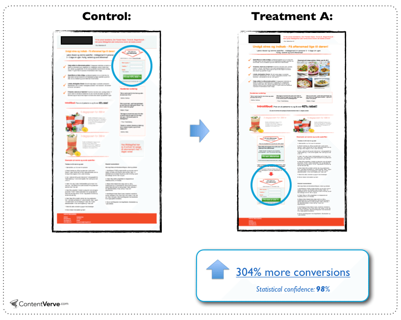
But they also argued that the product was complex.
The prospect has to learn a lot before deciding to take action on the page.
The more complex the product, the more information a prospect needs before making a decision.
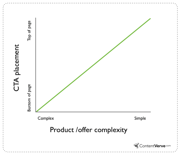
In this case, presenting the CTA too soon is like asking someone to buy when they barely understand how your product will help them.
Placing the CTA too long is like giving too much information. Or, wasting their precious time when they already know how the product can help them.
Here are the factors that determine where to place the CTA:
- The complexity of the product
- How familiar the visitors are with your product and brand
The color of the CTA button also matters a lot.
Green and orange buttons perform best.
But what color you use depends on the design of your website. You wouldn’t use an orange CTA button on an orange background.
The color you use should stand out on the page.
You’ll lose a lot of conversions if visitors can’t recognize your CTA button.
For example, Reiss call to action buttons doesn’t stand out on their page.
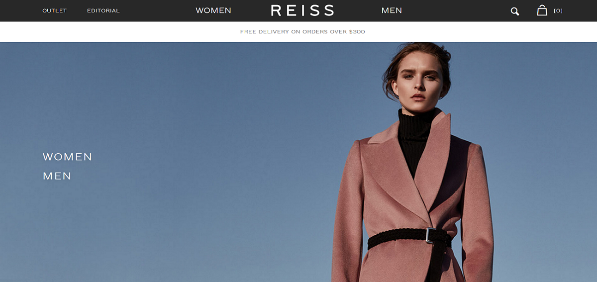
It is difficult to identify “Women” and “Men” as CTA buttons. They don’t really stand out on the page.
Here’s an example of a landing page with a better call to action button.
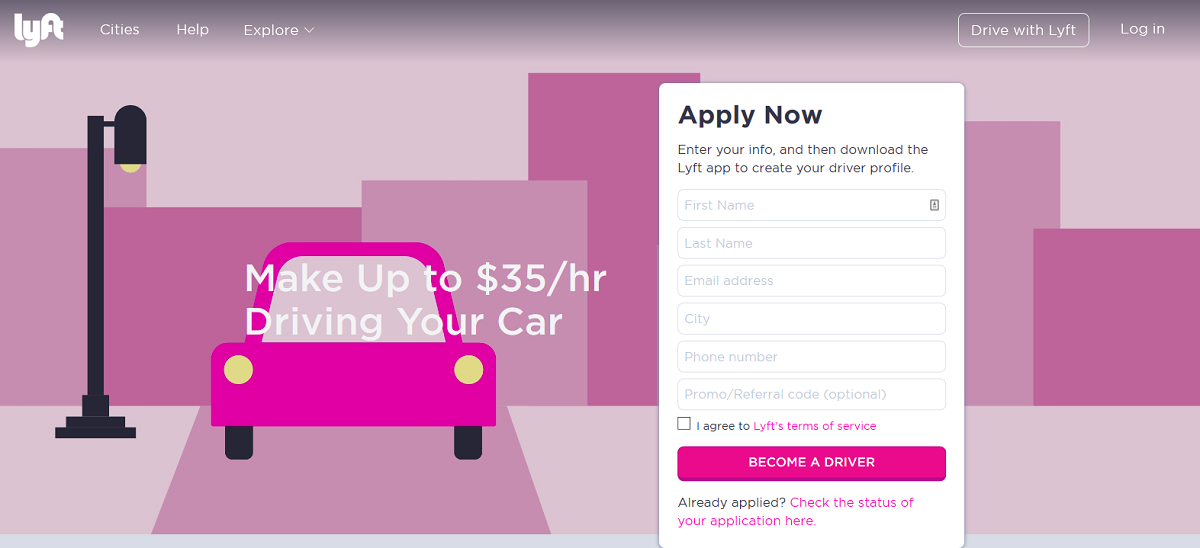
As you can see, Lyft makes their CTA stand out on the page.
You can quickly identify “Become A Driver” as a clickable link that takes you to the next step.
Here’s another page with a CTA button that is very easy to identify.
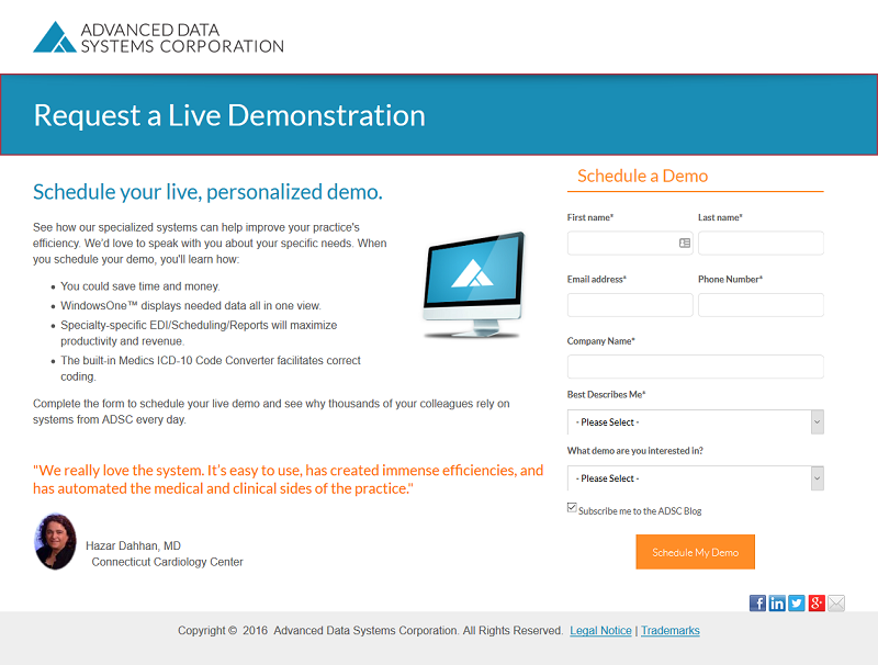
To get an effective CTA button like this, you should reduce the number of elements within your web page.
Then leave a lot of white spaces around your call to action button. That helps it stand out.
Offer Fewer Choices
We live in a world where we have many options to choose from.
My nephew has a common problem whenever we visit an ice cream parlor.
Chocolate chip or coffee chunk ice cream?
Cheeseburger or the turkey wrap?
Whatever he selects, he’s always afraid that the other option is better.
He’s not alone.
Many people find it difficult making choices. Including myself.
I’m sure you’ve experienced this common feeling before.
A situation where you feel that you’re making a mistake not choosing the other option.
Seeking the perfect choice is always a misery.
This extends to home hunting, colleges, and even marriages.
You’re always concerned if you’re making the right decision.
Prospects can easily become overwhelmed when you offer them too many choices.
When it becomes too hard to choose, they may decide to leave. That’s a valuable customer lost.
Instead, you want to make buying so easy.
So what should you do?
Offer very few choices.
Let’s use the social sharing buttons on our sites as examples.
Instead of presenting various social sharing buttons like this:
You should offer fewer options like this:
You’ll agree that it looks much better.
For example, in email marketing, you don’t try to sell multiple offers at once. It kills the effectiveness of the message.
You push just one offer at a time. That’s psychology there. It should be applied to every other aspect of your marketing campaign.
But, some marketers still break this rule. Even the popular brands.
For example, Kobo is promoting too many offers at a time here:

Customers are faced with too many choices. You want to make it easy for them to select.
For example, here’s a better email from Barnes & Noble:
This makes sense.
They are making a single offer to the reader.
Readers find it easier to choose here.
The same thing also applies when designing the perfect home page.
One of the reasons people like Google is because their home page only promotes one thing:
Search.
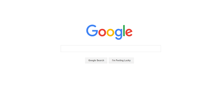
After landing on Google, you know you’re there to use their search engine.
Yahoo used to own the search space before Google came.
One of the reasons they lost so quickly is because their site is filled up with everything Yahoo does. There’s no emphasis on anything.
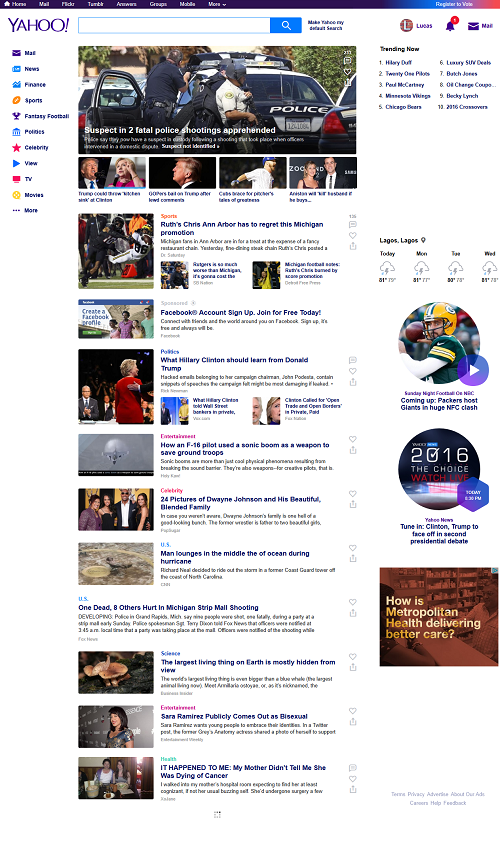
The search box is hidden at the top.
If Google, the most visited website in the world limit their homepage to just one action, why not you?
Google may not have seen this as a psychological marketing tactic.
But we can’t dismiss the fact this aspect helped made Google the best and largest search engine in the world.
This applies to all marketing aspects.
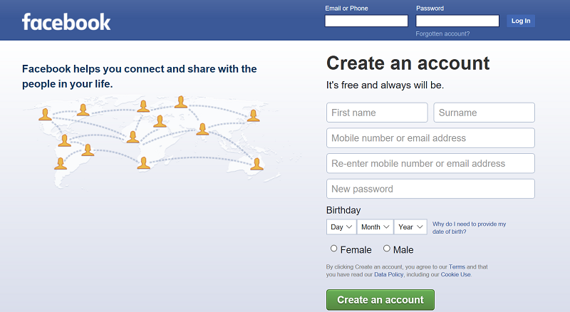
When you visit the Facebook homepage, you’re either there to sign in or sign up. Their home page is made for just those two actions. And nothing else.
Employ Reverse Psychology
What is reverse psychology?
“Reverse psychology is when you motivate someone to do something by telling him to do the exact opposite of it.”
For example, telling someone “I bet you can’t write a 500-word article today” might motivate them to do it.
But, I must admit that reverse psychology is a dangerous weapon.
It could backfire if the person realized that you’re intentionally manipulating them.
You should really know your audience, who they are, how they think (and what) before using it.
Reverse psychology is one of the most powerful psychological marketing tactics.
If you’re going to use it, the person you’re using it against must really trusts you.
For example, you shouldn’t use it on a stranger. It’s not advisable.
When I took my girlfriend shopping a few weeks ago, we were at a fashion store, and I saw some dresses I really admire.
But there was a problem:
They aren’t cheap.
My girlfriend quickly sensed that I was feeling the same.
So, she asked that will leave because they were expensive. She said we can’t afford them.
That hit me real hard.
I said, “Why can’t we afford them?”
I said we can. So we bought some dresses for her.
Her suggestion that we can’t afford them made me fought back. She was happy at the end.
Maybe she didn’t intentionally use the reverse psychology. But it worked on me.
Don’t forget the warning I emphasized above:
Someone must trust you before you can use the reverse psychology on them.
In my case, I trust her.
I think that’s better than a stranger walking up to me and using the tactic on me. It surely won’t work.
Trust is an important factor when using the reverse psychology.
The reverse psychology works beyond just trying to sell your product.
It’s a marketing tactic that gives prospects the easy way out.
They know that they are not being pressured to buy at all.
Many people are used to seeing high-pressure techniques.
By using the reverse psychology in your marketing, you’re giving them a unique experience competitors don’t have.
As a result, your customers’ confidence in your product increases.
Telling them your product is expensive and they probably can’t afford it assures them that you have a high-quality product.
Using this powerful tactic is another way of telling those who might complain about your expensive product that you don’t want them to buy your product.
It’s a way of saying you don’t want them on board. So they shouldn’t complain at all.
The good thing is some of them will want to prove you wrong. Even if it means buying your product will affect them financially, they will still want to have it.
Add Urgency
One of the key features of the brain is urgency.
Smart marketers know it. They use it to make a lot more sales than their competitors.
Urgency causes people to act quickly.
People think too hard, wait too long, or simply don’t respond when you ask for the sale.
Adding urgency makes them reconsider their stance. In fact, you give them little time to think.
Imagine when you land on a sales page, you may have to access your finances, or maybe wait till next month.
Or, maybe check what the competition offers.
But when there’s some kind of urgency, you’ll want to act as fast as possible so you don’t miss out.
There are different ways you can add urgency to your page.
It could be scarcity. Like saying that there are four pieces left and it won’t be available again until further notice.
It could be clock timer or countdown. Like when you say something won’t be available after a certain time.
It could be loss aversion. Like saying that prospects won’t get certain benefits if they don’t buy until a certain time.
It could be associating your product with certain unpleasant situations the prospect might experience. No one wants to find themselves in a negative situation.
It could also be threatening to pull the offer away. When you tell customers you are going to stop accepting new customers.
There are many ways to create urgency in your offers.
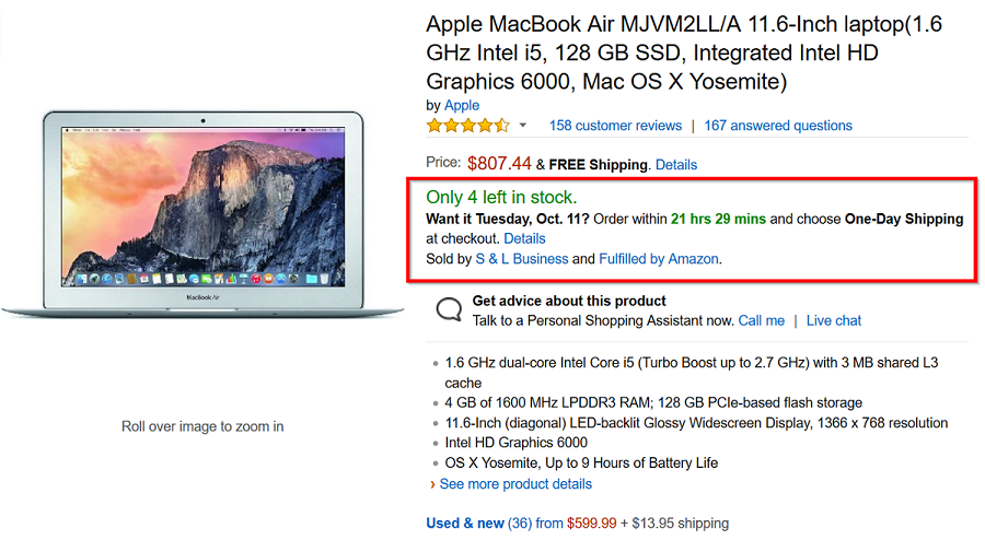
Here’s Amazon using urgency on a MacBook Air page:
All the psychological marketing tactics revealed in this article are very effective.
Start using them today. And your sales will increase.
Thanks for reading and please share this article with your friends on social media.
Related articles: marketing mistakes, inbound marketing strategy, boost your online marketing, things you should know before starting a business blog
Hi Jabed!
Marketing psychology is a buzzword for marketer. After trying lots of ideas and fall we learn how to do product marketing immaculately. Add urgency is a common trick that websites do now-a-days.
This is indeed an in-depth article on this subject and who have done a great job to produce it. I enjoyed reading it, Thanks for sharing this article and have a great day ……………….
Average content.
I got 11 marketing psychological techniques in the net. And your only 5 tactics are more or less common. Anyway, I appreciate your image selection which is quite good. 🙂