Many people think that conversion rate optimization is mostly depended on content.
The above statement might be true but at the same time you cannot afford to overlook the significance of design as the wrong web design elements can hold your site back from accomplishing great success.
A study by website optimization revealed that, you have less than a second to persuade a visitor to stay on your page.
In online trading, creating trust is much harder than in real life as people can’t see your face. All that they can judge you by in that first second how well your website design is.
So, there is no doubt about that the design of your website has a huge impact in your conversion rate.
There are many website design mistakes that can hurt your conversion rates. In this article I will walk you through some of the most common mistakes people make while designing their website.
Website Design Mistake #1: An Obsolete Website Design
If your website is designed five years back, then it’s the time to upgrade the web design with the new design elements.
There is always some emerging technology that allows the designers to upgrade the design.
For example, you have thousands of visitors and if you are unable to keep them on your page then it’s all for nothing.
Trust me, nobody likes a page that seems like has not been updated in five years.
Believe it or not, there are so many old websites still live but they are no longer in operation.
When your visitors come to an old looking websites, most of them will click away as quickly as possible and moving on to your competitors.
Therefore, having a modern website is essential to keep your website conversion alive.

Image Source: wilsonmediaconsulting
Website Design Mistake #2: No Prominent Call to Action Button
Your website definitely has a goal. Whether you want your visitors to sign-up for a mailing list, make a purchase, request a quote, or simply call you, there has to be an objective and you have to make it clear to your visitors what your goal is.
In many cases, low conversion rates are a direct outcome of a call to action getting lost in the web design.
Just take a look at the below image and it has no prominent call to action button. There is a weak one, written in a light blue font, on a dark blue background saying: “Click here to book online” which can easily be overlooked by the visitors.
You need to ensure that your call to action button stands out on the page and makes it easy for the visitors to take the desired action.

Website Design Mistake #3: Slow Loading Time
Slow page load time kills your website conversions. Nobody wants to wait for a page on a website to load
According to surveys done by Akamai and Gomez.com nearly half of web users expect a site to load in 2 seconds or less, and they tend to abandon a site that isn’t loaded within 3 seconds.
According to KISSmetrics, a delay of even one second can reduce your conversions by seven percent. So, imagine if an e-commerce site is making $100,000 per day, just a 1 second page delay could potentially cost them $2.5 million in lost sales every year.
There are many reasons that contribute to a slow loading time. Among them few common reasons are outlined below-
➯ Excessive use of Flash
➯ Images are too big
➯ Broken Links
➯ Too many plugins in use
➯ Bad Coding
You website loading speed should be as fast as Ferrari. Here are some tips to reduce your page load time-
➯ Optimize your images
➯ Minimize HTTP requests
➯ Utilize server side caching
➯ Limit 301 redirects
Website Design Mistake #4: Overuse of Colors
Color can make or break your website conversion rates. Using too many colors can confuse your visitors.
Understanding the color phycology is essential to choose the right color for your website. Take a look at some of the colors below and the associated feelings they typically convey:
- ➯ Light Blue: cool, youthful, masculine
- ➯ Dark Blue: trustworthy, stable, mature, calming
- ➯ White: pure, honest, clean
- ➯ Green: comforting, growth, organic, positive go,
- ➯ Pink: youthful, warm, feminine
- ➯ Gray: integrity, neutral, cool, mature
- ➯ Purple: youthful, royal, contemporary,
- ➯ Yellow: emotional, caution, positive
- ➯ Red: excitement, hot, danger, stop, negative,
- ➯ Orange: organic, emotional, positive
- ➯ Black: heavy, serious, death
- ➯ Brown: organic, unpretentious, wholesome
- ➯ Gold: stable, elegant, conservative

Remember, colors play a crucial rule in web design. They help to highlight buttons, links and even enhance the visitors overall web experience.
Some of the golden rules are outlined below when selecting your website colors:
- ➯ Keep the associated feelings for each color in mind
- ➯ Limit your palette to about 2 to 3 colors only.
- ➯ When in doubt, choose ONE color and then try different shade variations.
Website Design Mistake #5: Using Cheesy Stock Images
It’s no wonder that images are a fundamental part of website designs and modern readers are obsessed with visual media.
You’ve probably heard it many times that they’re worth a thousand words and visual content drives more engagement.
Yes you heard it right if the images are relevant, meaningful, high quality and authentic.
Using the stock images undermine your credibility. Avoid using the cheesy stock photos as they can send the wrong message to your audience.
Every image you use in your website need to have a purpose like pushing the visitors toward the conversion goal.
Make sure you only use the meaningful, high quality, and relevant images where possible in your website.

Image Source: contentmarketinginstitute
Website Design Mistake #6: Poor Navigation
It doesn’t matter what you are selling and how much content, images, and video you have. You website navigation play an important role to convert the visitors into customers.
Navigation is the only way to reach your products or services after the visitors arriving on your website.
If you appropriately executed the right navigation tactics, your visitors should smoothly find the way towards the action you want them to take such as to subscribe or to buy.
If your website navigation is confusing, your audience will rapidly take the exit route and probably never come back to your website again.
Therefore, your navigation should be easy for the visitors to find what they are looking for.

Image Source: Squarehalo
Keep your visitors to the right track by providing noticeable call to action, ensuring links are easily visible and lead to the right pages, and keeping enough breathing space.
Website Design Mistake #7: Website Not Being Responsive
Human behavior has changed dramatically since the mobile devices entered our lives. People use their smartphones or tablets on the go, in their beds, even in the bathrooms.
“The number of people using mobile devices outstripped people on desktop computers in 2014.” – Jim Edwards, Business Insider , April 2014
It’s almost the middle of 2016 already you cannot afford to ignore the responsiveness if you don’t want to lose the potential customers.
So, if your website is not responsive, then you will not be able will not be able to target the tab and mobile users.
Responsive design is a must, not a nice to have anymore.

Website Design Mistake #8: Cluttered Design
Too much complexity or clutter makes it tough for the visitors to absorb your marketing message.
Excessive use of colors, images and styling makes your website cluttered.
Here is an example of a cluttered website.
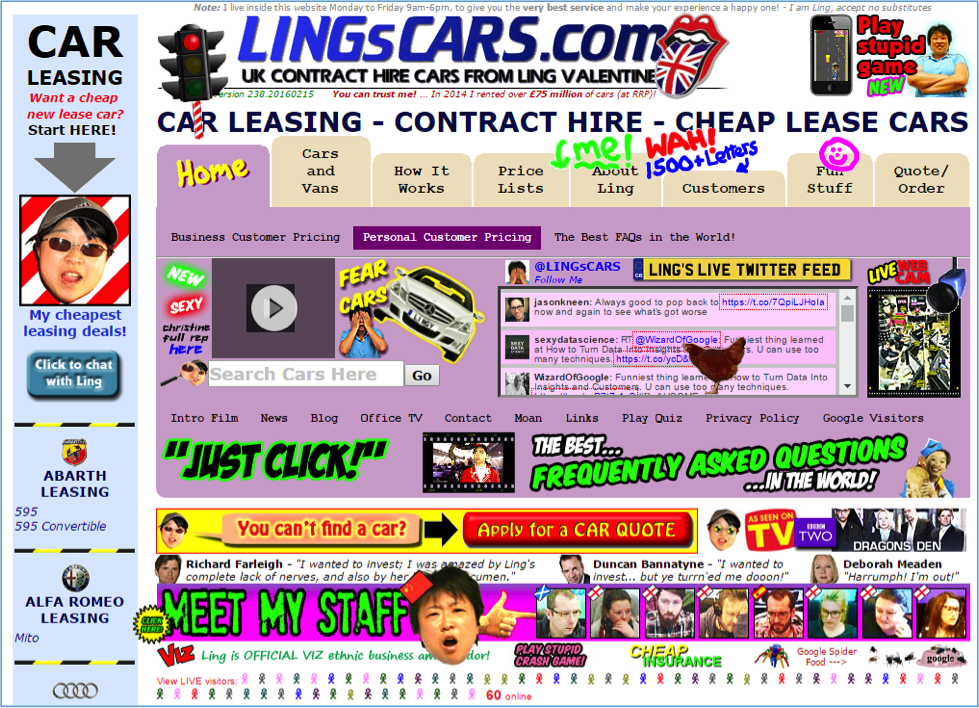
After looking at the above picture I am not sure what to click where to look because there is so much going on.
This is why it is important to deliver only the most important or necessary information above the fold basically, anything essential for making a decision or taking action, without any clutter.
As a rule of thumb, don’t give everything at once to your visitors. Instead, encourage them to browse on your site to learn more about you before trying to sell to them right away.
This will not only help them get to know your brand but also they will be more likely to convert as they already spent so much time on your site.
Website Design Mistake #9: Using Too Many Plugins
Plugins helps a website to introduce new features or add new design to the website.
Web designers can get so many free plugins from the internet to use in website.
But, using too many plugins can increase your site loading time.
I already have discussed the impact of slow loading time at point no #3.
Certainly, if the plugins are really required to make your site functional then only use them.
Sometimes people try to use different things just because they can into their website not because they really need to.
Make sure you don’t use any extraneous stuff unless you must need it to keep your page loading times fast.
Website Design Mistake #10: Choice Overload
Choice overload leads to choice paralysis. If your visitors can’t make the decision, they won’t take your desired action.
There are many side-effects that you will experience when your visitors face the dreaded experience of choice overload. Some of the common effects are given below-
- ➯ Customers buy less
- ➯ Customers put less thought into choice
- ➯ Less satisfaction
A famous study about too many choices proved that people who were limited in options were more to buy than those having many choice.
Therefore, reduce the number of choices your visitors encounter and remove the irrelevant or unnecessary links, ads if you want your visitors to take your desired action.
Website Design Mistake #11: Adding Too Many Banners
An over aggressive web design with large images and lots of banners makes the website appear as one big advertisement platform, which is a major turnoff for visitors and a clear obstacle for acquiring a high conversion rate.
Let me show you how a website looks with too many banners.
Even though banners are great revenue generator, they could be performing negatively when it comes to conversion.
A simple redesign could accomplish the best conversion rates. Here are the few things you can apply to get over with this issue.
- ➯ Limiting the number of banners on a page
- ➯ Reducing the prominence and size of the banners
- ➯ Highlighting relevant content and images
Website Design Mistake #12: Unreadable Copy
As much as images and videos control the modern content, copy or text still play a huge role in persuading visitors to make a purchase.
I have seen so many websites have oddly-shaped fonts and large text blocks that are hard to read.
The above example looks nice but can you read it?
While we are all a fan of customized and beautiful fonts, too much of a good thing is also bad.
Here’s how you fix it:
- ➯ Choosing legible font styles.
- ➯ Use font size 16px or more
- ➯ The formula for line height is 1.6 * the font size
- ➯ Emphasize important information with bold
- ➯ Write shorter sentences
- ➯ Align text to left, not center
Website Design Mistake #13: Not Having a Search Box
Websites that fail to include the search box are losing some potential customers those who are looking for specific information or items.
They don’t want to use your carefully executed navigational links anymore because we are all busy and don’t have time to search manually.
Trust me, your visitors aren’t even a little bit patient.
Eventually, they will leave the page.
Therefore, enable the search box option in your website to find the targeted items or information in no time. It works better if you have a large inventory.
Bottom Line
If your website has any of the above 13 website design mistakes, it’s time to consider a new design.
Use this article as a checklist of website design mistakes to fix now and avoid in future.
Keep in mind that even the simplest mistakes can ruin your conversions right off the bat.
Related articles: landing page conversion, creating squeeze pages, why your opt-in page isn’t converting, which landing page best suits
Hello Jabed Bro,
Thanks for the awesome and helpful post. You mention here website loading time and using too many plugins as website design mistakes. But website loading time not only depend on design, it also depends on hosting server. And how using too many plugins related to web design?
Hello Jabed,
Thanks for your informative and clear illustration regarding website design mistake.
It sounds cool to read blog with relevant images 🙂
Anyway, According to me pool website navigation and with call to action is the core mistake for any website , if you consider conversation rate. According to human psychology, people are so hurry while searching information from web. It may take 10 or 15 sec for skimming website. If website have good navigation and proper information, they may stay on access page. Otherwise, they may look for different website.
Cheers
Ben William
Hi Jabed,
Amazing piece of content. I would like to share one such mistake. I started using an ad monetization network, which showed pop up ads to the visitors. But, it was an incentive-based monetization network, so basically, you get paid for app installs or user sign-ups. Revenue Hits to be precise.
A few days later, I got a message from Google Webmasters that my rankings have slipped up because they detected social engineering on my website. Had to remove those ads instantly. But luckily, I get to know about what mistake I made and learnt from it for not making it again.
I’m glad that you shared this article.